CONDOS RENOVATIONS
YORKVILLE, CONDO RENOVATION
Winner of Best Overall Renovation
Winner of Best Condominium Project: Over $200,000
Building Industry and Land Development Association (BILD) – 2022
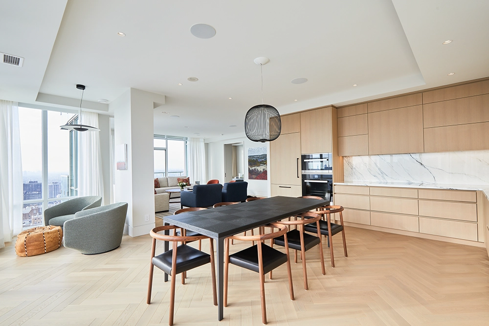
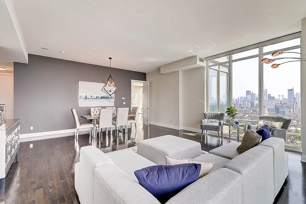
The client was downsizing from a 5000 Sq.Ft. house to a 2000 sq. ft. condo on the 27th floor of a busy 32 story condo building that was built in the early 2000’s in downtown Toronto.
Being a condo, there was no ability to add space to its existing footprint and the floors are all concrete, so space planning and design were keys to this project.
Design details that helped create a harmonious palette throughout for Flooring, Cabinetry, Countertops, Backsplash, Lighting and Accessories included the following:
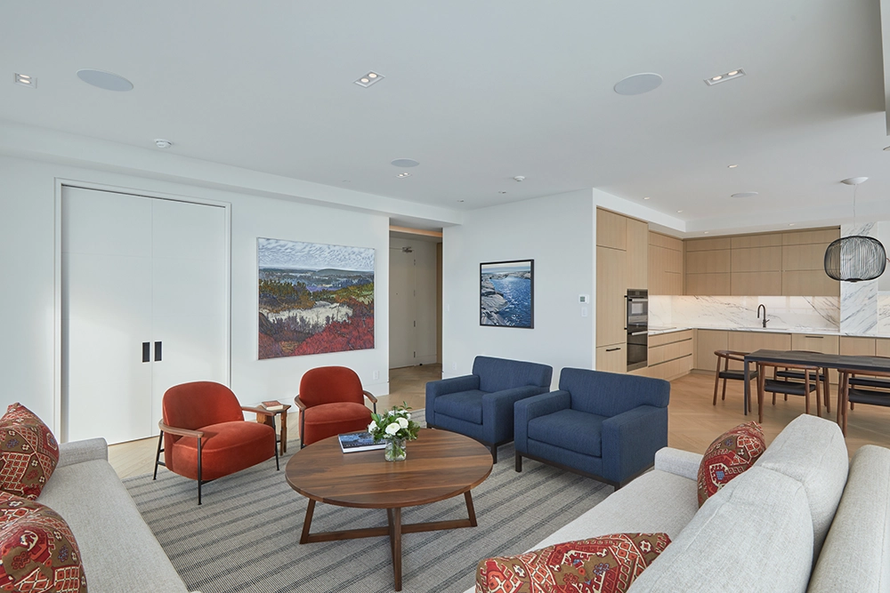
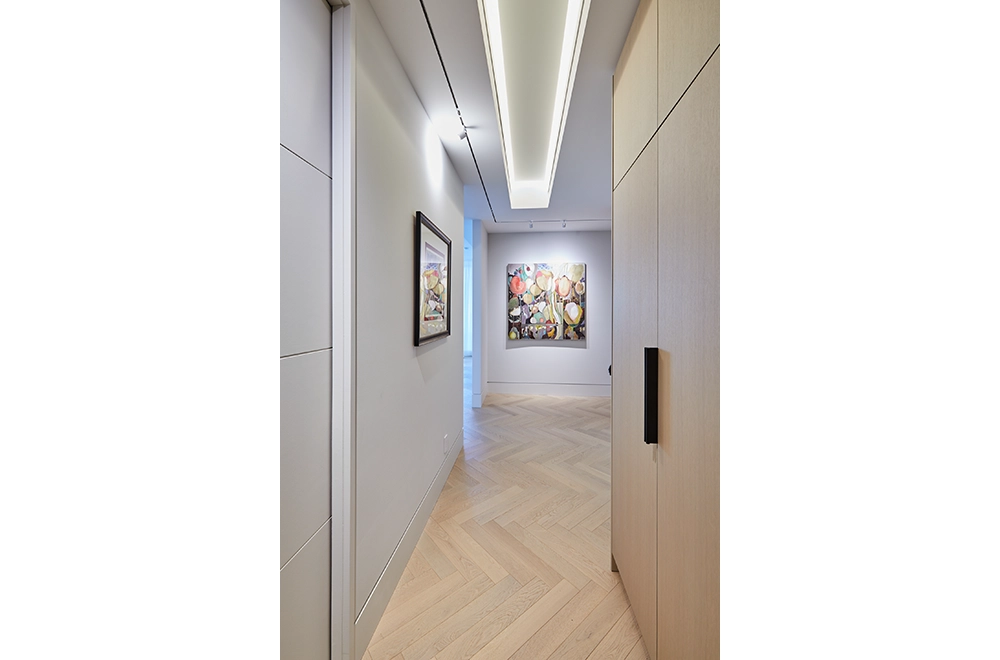
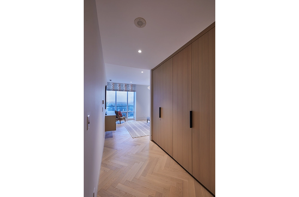
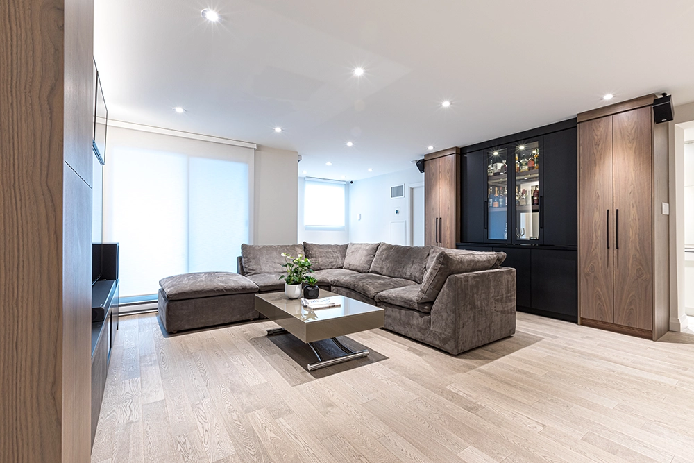
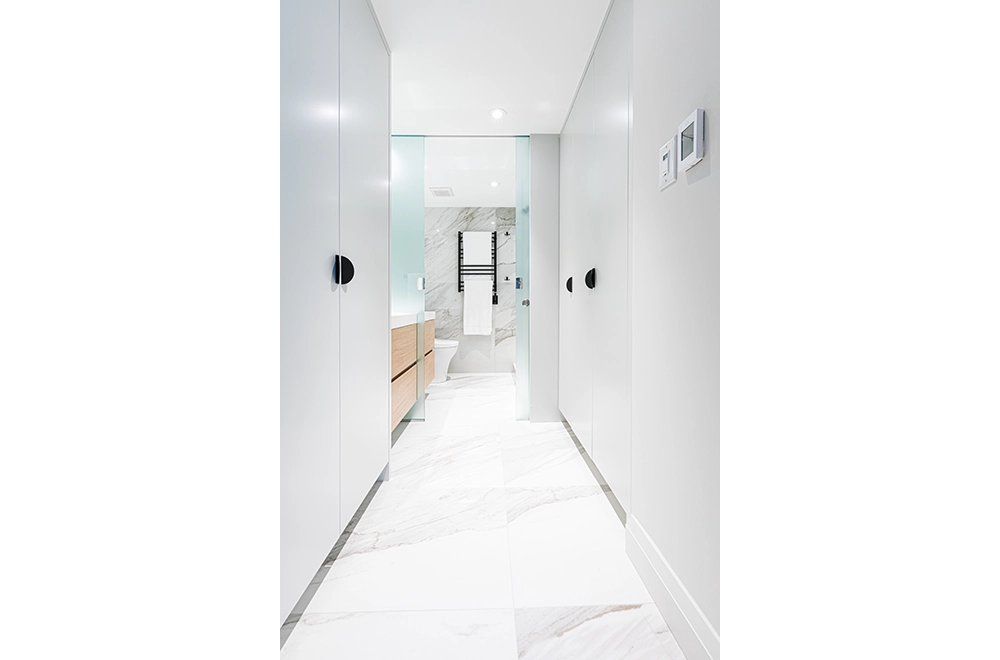
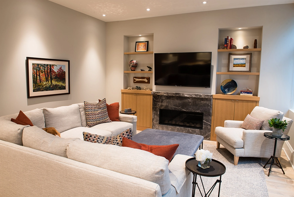
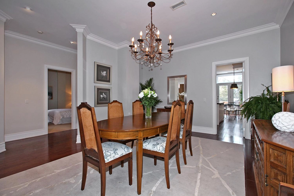
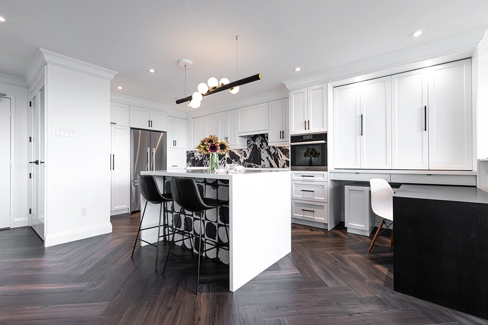
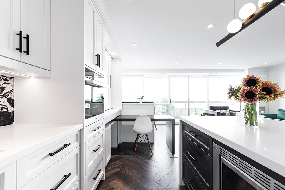
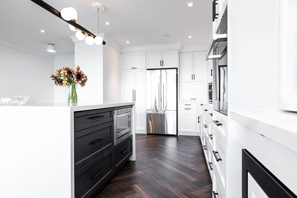
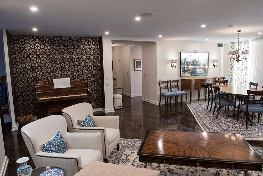
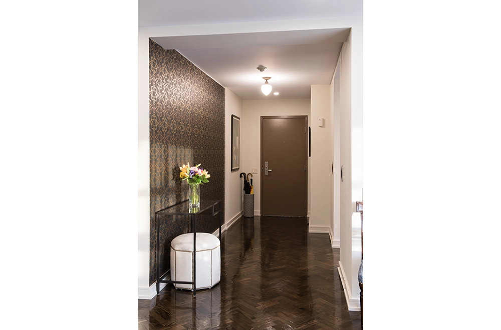
All flooring throughout except for bathrooms, laundry and powder room was engineered, prefinished white oak in large format herring bone pattern which creates a subtle flow.
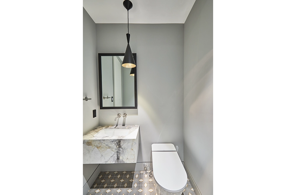
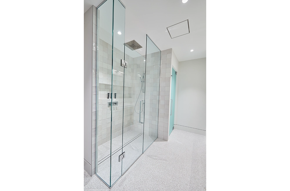
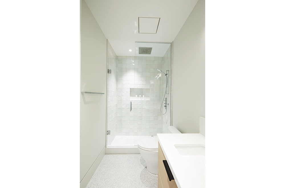
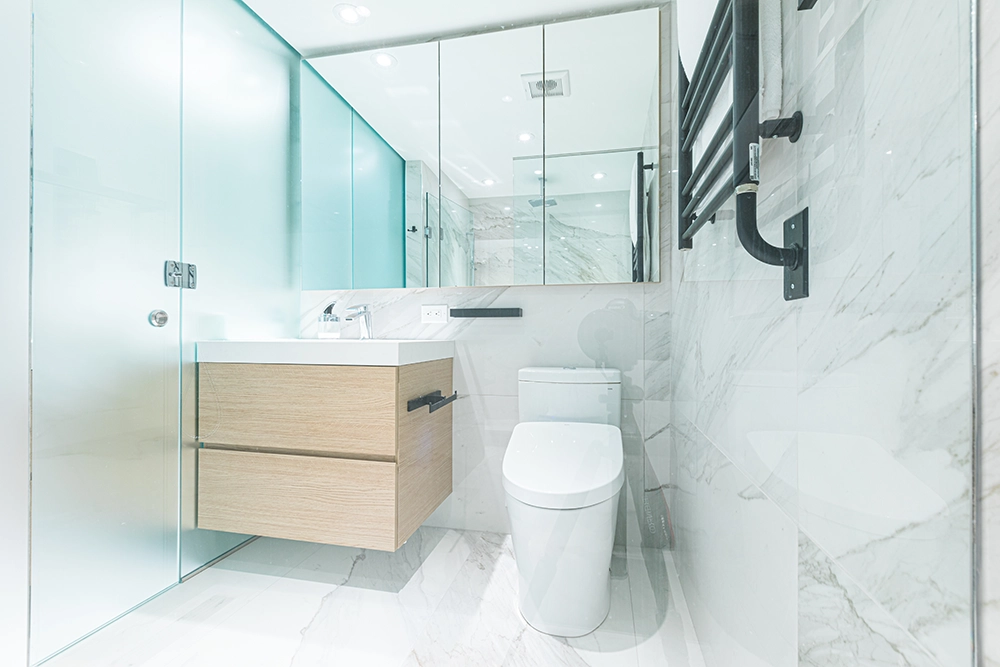
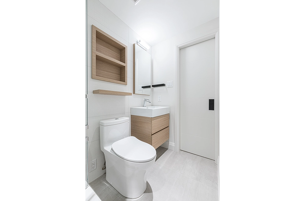
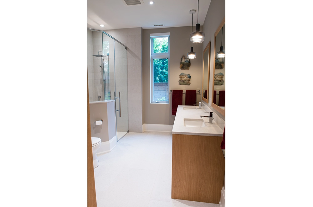
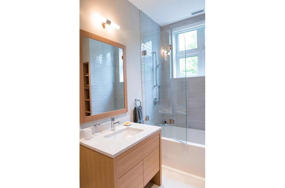
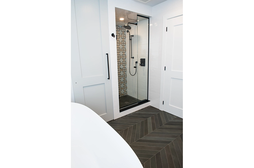
Powder room and laundry floor repeating pattern in a 6”x6” ceramic tile as well as the Bathrooms large 24”x24” pebble porcelain pattern create a visual interest to enhance each space. Shower wall tiles were variegated ceramic tiles with glazed finish.
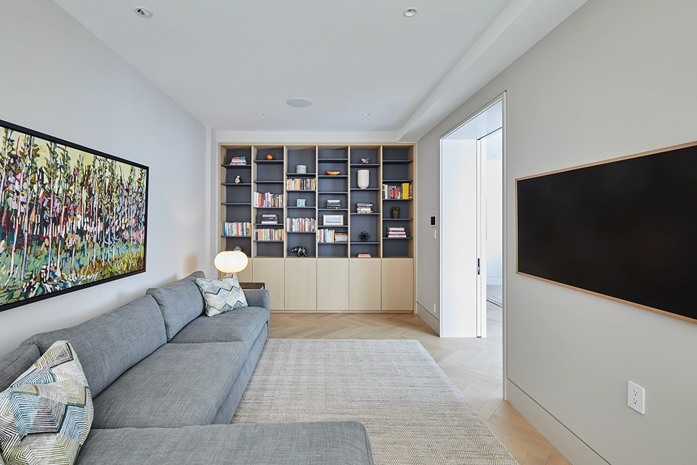
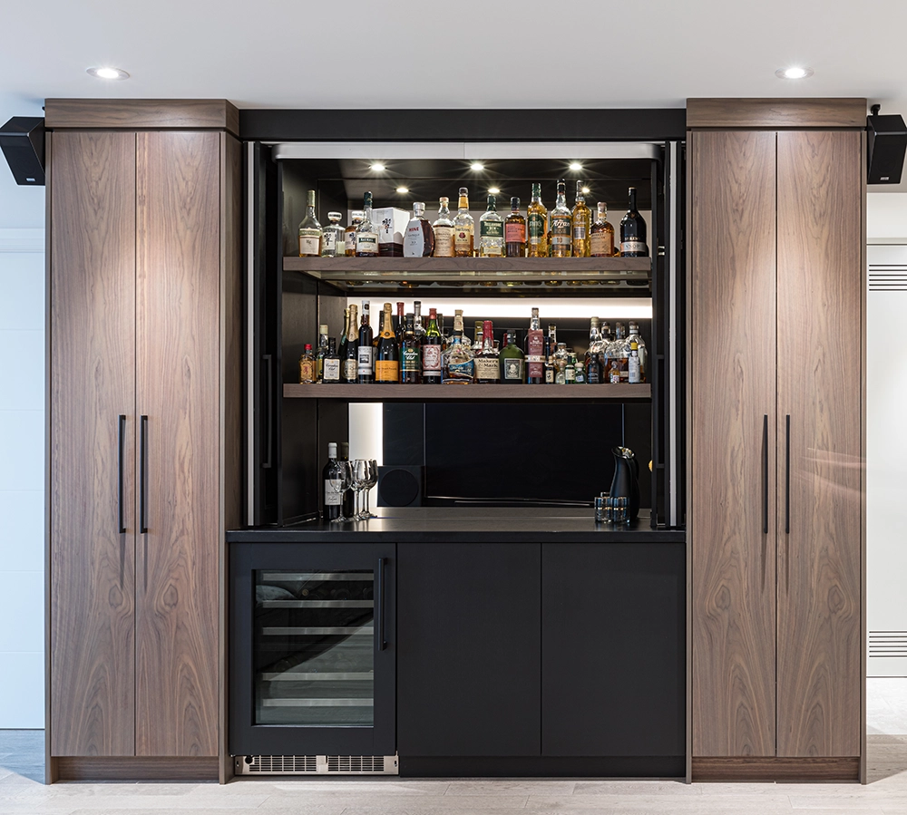
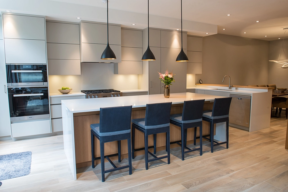
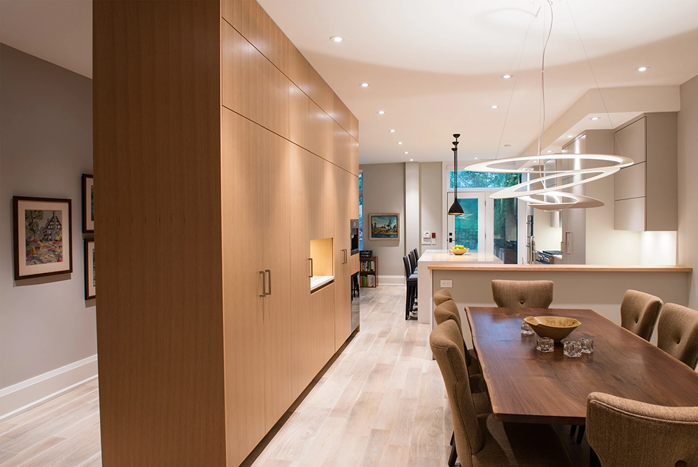
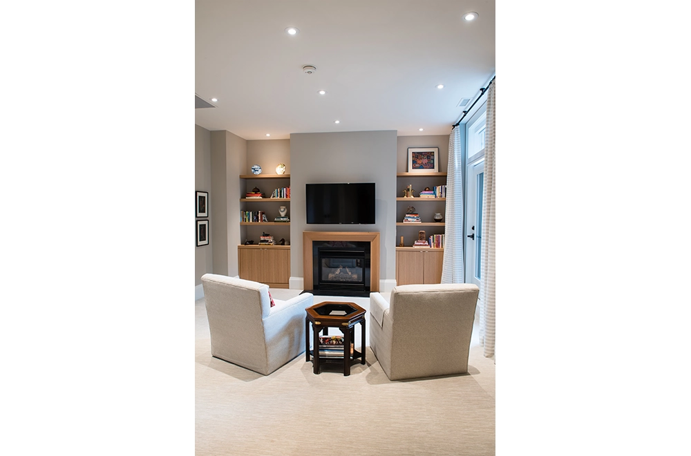
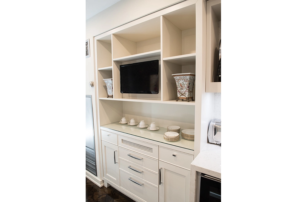
Cabinetry throughout replaced all closets to save space and add efficiency for both use and function. All cabinetry was white rift cut oak stained to fall in line with the floor colour and finish.
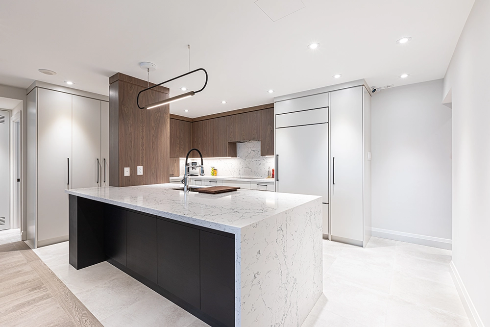
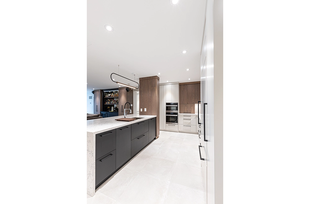
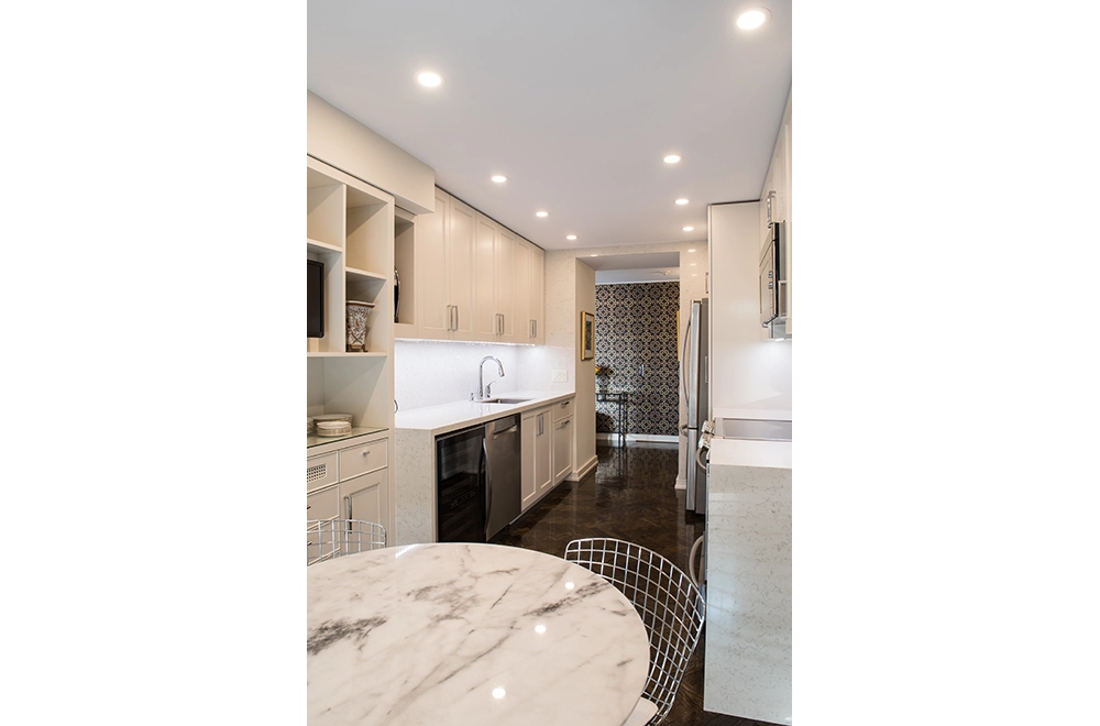
Bathroom countertops were in quartz to blend into the rooms whereas in stark contrast, the Kitchen and Powder room countertops and Backsplash features incredible art in Marble. Powder room and kitchen installation required structural hangers to support the marble.
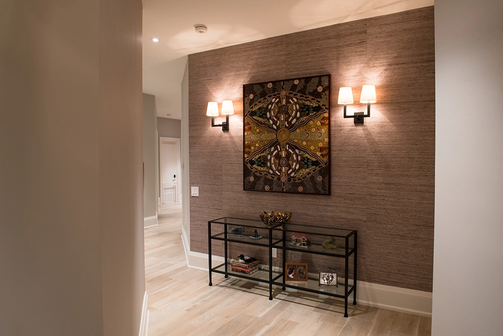
In order to create space to hide window treatments and add general and accent lighting throughout, we framed the ceiling down by 9”. This gave us full flexibility to put lighting anywhere we wanted. High end LED single and double pot lights were installed along with custom track lighting in foyer and hallways to create the art gallery affect. Undercabinet for task and decorative lighting in kitchen and bathrooms were also used.
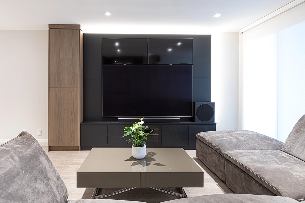
Control4 smart home automation controls all lighting, shades, audio and TV functions throughout the condo.
Completing the details of the space with black door and cabinet hardware and some plumbing created continuity in the spaces.
The most time consuming detail of all was the perimeter ½” reveal around all baseboards, door and cabinetry casings, creating perfection and no room for error to complete the space.
To create a better functioning condo space plan, the following steps were taken:
We fully gutted all finishes throughout. Most rooms stayed in the same place with slight adjustments made for better function. The largest changes took place in the following areas: Front entry, Kitchen and Living areas, and the Primary Bedroom suite.
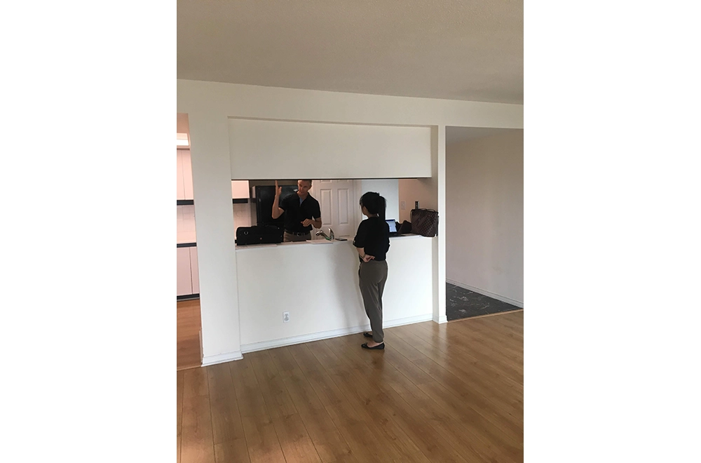
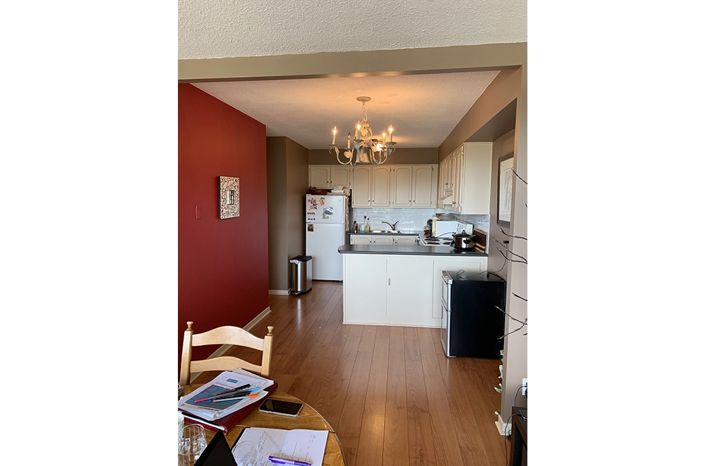
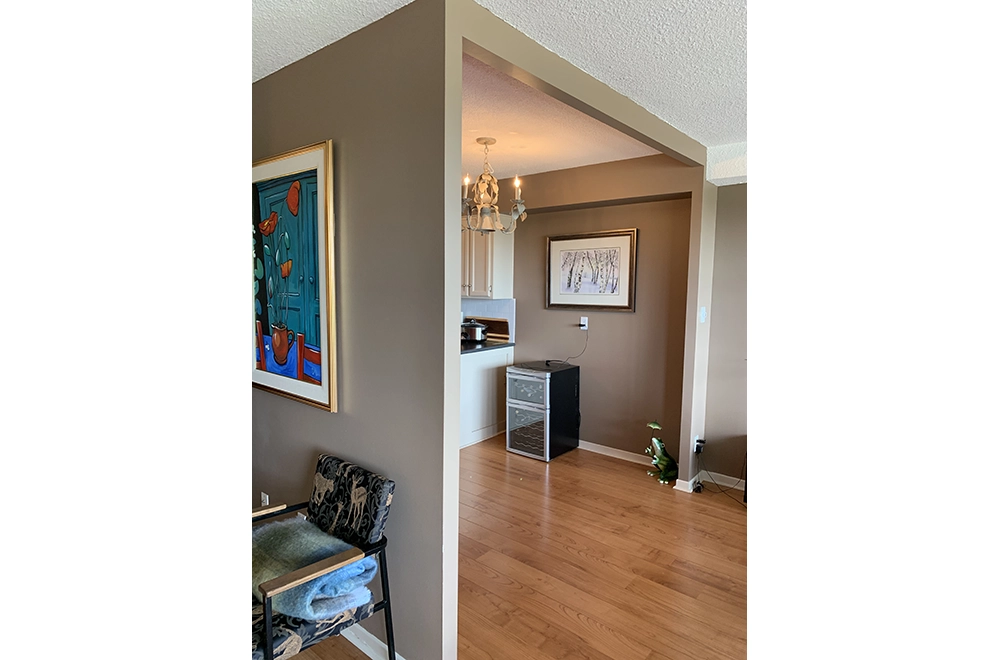
In the Kitchen, originally there were 2 entry points: one off a small service hallway from the Front entry and the second off the dining room. The Kitchen was a separated space with doorways only to connect to living areas.
By removing all of these walls and recreating the spaces we were able to design a highly functional Kitchen and Dining area with a large amount of storage space and full view into the living room.
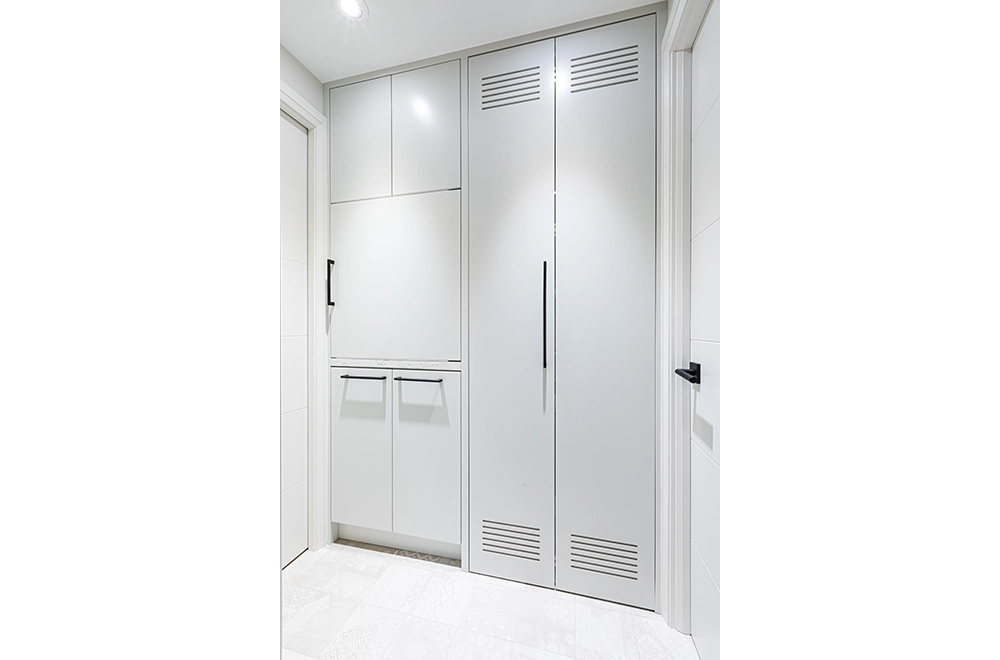
We also created a very functional laundry room with storage for both household items as well as the Control4 main panel. The new space was on its own off the foyer and would not interfere with main spaces as it did in the original layout.
In the Primary Bedroom, the original layout had you walk into the ensuite and closet area as soon as you walked into the room. The Bathroom was very dark with no natural light and was closed in. the walk-in closets had so many doors in the corridor that you could only have 1 door open at a time.
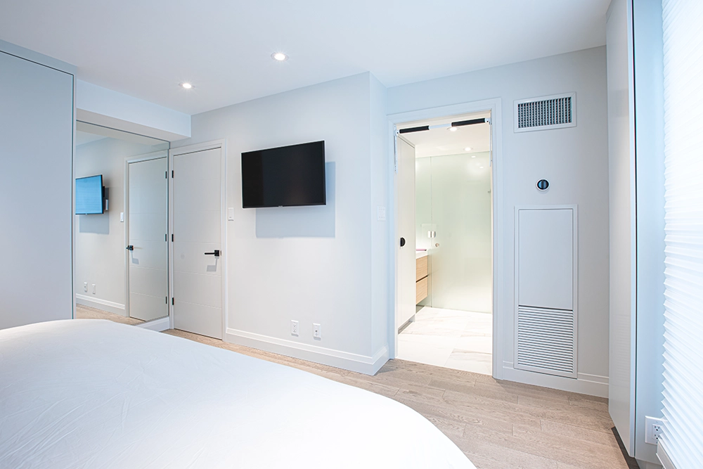
By removing all these walls, reworking the plumbing as much as possible, we were able to create a bathroom with a better entry location within the bedroom and added a natural light source.
The closets were turned into a full wall of built-in cabinetry with lots of space for viewing of clothes and function in and around the space.
WATERFRONT, CONDO RENOVATION
Winner of Best Condominium Project: Over $200,000
Building Industry and Land Development Association (BILD) – 2019
The Condo owners had been living in the building for years as renters and finally found a condo they would make their own. Built in the 1980’s, this 2-bedroom condo had seen minimal changes to the cabinetry, fixtures and finishes. It was a blank slate.
Our clients’ goals for the renovation were the following:
- Full removal of all finishes – cabinetry, flooring, bathroom and kitchen finishes.
- Open the Kitchen into the Living area to maximize views to the west.
- Re design the layouts of both bathrooms as well as the flow of space between the rooms.
- Lots and Lots of Storage.
- Design with a refined contemporary aesthetic utilizing a colour palette of light and dark tones along with warm natural wood accents.
- Add lighting, smart home and security features throughout.
Goal number one was simply to just gut all finishes down to base structure and see what we had. In condos it is always a bit of an unknown as to where services are in order to know what walls can be removed or adjusted. The walls dividing the kitchen and living room were all removed except for one section which houses the building plumbing mains.
During the design concept phase, we made slight adjustments to the layout. Originally there were 2 bedrooms with Ensuite bathrooms. We changed the bathroom entry originally for the Guest room/Office to come in off the main living area adjacent to the Laundry. The bathroom itself changed from a 3 piece with a stand-up shower to a 3 piece with a bathtub shower. In the Master bedroom, the original bathroom was a very small 3 piece with a bathtub shower and single vanity. The new design created a large shower area and a double sink that was divided by an etched glass pocket door for privacy. The second sink was situated on the walk-in closet side of the space. Removing the original wall and replacing it with a glass pocket door partition opened things up, created light and maximized the space.
Creating storage was the most important feature required for this renovation. This client’s goal was to waste no space. Custom cabinetry was designed and built for the following:
- Foyer for jackets, shoes, and boot storage.
- Kitchen or all utensils, plates, etc.., including accessories to utilize corners and drawer organization.
- Entertainment area for audio, video components, and 3 TVs for NFL Sunday.
- Bar to house wine fridge, liquors, and special dining wear.
- A hidden laundry area including sink, cleaning supply storage and stackable laundry machines.
- Both bathrooms included large amounts of recessed storage and vanities
- Master bedroom with built in bed flanked by perimeter wall storage, walk-in closet, and ironing board cabinet.
- Office was customized with 2 desks, filing cabinets and walls storage.
To achieve the desired look, the cabinetry was mostly painted in white with deep blue and walnut accents, while the vanities and in-wall storage were built using rift cut white oak. The flooring throughout was a mix of white oak hardwood and large porcelain tiles. Bathroom walls were cladded with large porcelain tiles. White quartz countertops were installed in both Kitchen and bathroom areas with a Black quartz for the Bar top. Slab doors for the cabinets and room entries framed with flat stock trim work, then accessorized with black linear hardware fully defining the contemporary lines that flow throughout the condo. LED pot and undercabinet lighting accents each room to complete the presentation.
What problem or opportunity did this project solve?
Unlike a house, a condo’s elements are very hard to change, typically the structural and building services. In order to create the open concept between kitchen and living room, one wall had communication and electrical in conduits running vertically. This would challenge our design to have a full view open concept. In order to remove the wall section, we had to cut these lines at the floor, chisel concrete to run the lines to the plumbing main buildout, then run them up and over back to the original position and reconnect.
Condos are typically built with no space in ceilings to add or change lighting. The ceilings were lowered to create space for pot lighting and run wiring for smart home features and security throughout the space.
LAWRENCE PARK CONDO RENOVATION - DESIGNERS WCM + SARA BELLAMY
Winner of Best Condominium Project
Building Industry and Land Development Association (BILD) – 2017
The 2,000+ square foot suite was large but divided into many defined rooms which made it feel much smaller and dated. Although the suite had a wall of windows leading to an exterior terrace, the natural light was not available to most of the condo. The goal was to create better flow and layout by creating an open concept design for the bulk of the space and re-purposing areas. The family room and the master bedroom were reversed to allow for a larger kitchen, family room and dining room space.
Several walls were removed to open the existing kitchen into the dining room and the new family room area. The new master bedroom suite was created by combining and removing walls dividing the original living room, library, and den, converting it into a bedroom, lounge area, walk-in closet and ensuite bath. The guest bedroom and bath were also upgraded. In the new layout, the bathrooms where switched I order to create the new flow of space.
Beautiful custom wood cabinetry was installed in the kitchen with high end appliances. BLUM kitchen accessories were installed with BLUM Aventos, servo-drive automation, soft close drawer and door function, spice drawers and storage pullouts to improve the kitchen functionality and ease of use. The floor finish chosen were large porcelain tiles with wood grain finish for the look of wood but durability and ease of cleaning as the homeowner has two large dogs. The electrical and mechanical work was detailed and extensive due to the extent of changes and construction work to be completed. A new high efficiency heating and cooling system was installed, and the ducting was altered to limit the impact to the kitchen cabinetry. The original large hot water tank in the laundry room was upgraded to an on demand HWT which gave back space in the laundry room to allow for a countertop and storage.
THORNHILL, CONDO RENOVATION
Winner of Best Condominium Project: Over $200,000
Building Industry and Land Development Association (BILD) – 2020
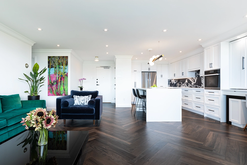
The main Living areas of this older Thornhill condo were south facing and in original condition. The Clients main goals were to add natural and incandescent lighting to Kitchen, create an open concept with larger Kitchen, ice and Dining areas., and create abundant storage space with functional accessories. The challenges were whether we could remove walls in relation to the building services – Plumbing, Electrical, Network, HVAC. Also, how could we add lighting when the existing ceiling is a concrete slab.
In the walls to be removed, there was both Electrical and Network cabling that ran from the main level to the top floor of the building. To remedy this, we received permission to trench the concrete slab and re-route the wiring across to a close by wall, up the wall then back over to continue connections without interruption. The ceiling was framed down by 2” total to allow for wire routes as well as new thin LED pot lighting, which created the flexibility for incandescent lighting positions throughout the living areas.
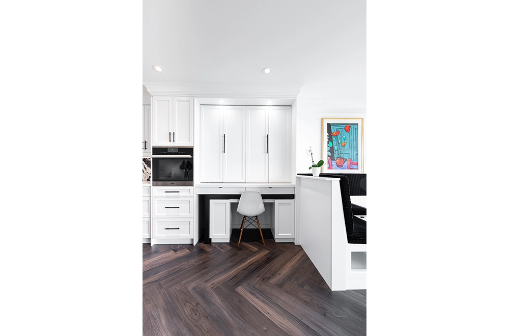
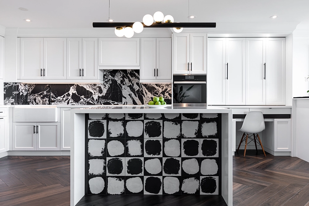
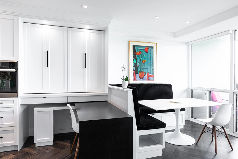
Aside from Lighting, other special features included a hide away swivel-desk and ice behind doors within the Custom Kitchen Cabinetry, a Banquet Dining area with flip-up-seat storage, a Cat food nook, and an Island with Bar seating.
Supporting Materials that were utilized included – KAR OPUS Plank 6″x36″ Vinyl flooring in Herringbone pattern, Quartz Caesarstone countertops, Custom Built Cabinetry Painted, Accent Porcelain Tile Backsplash and Island wall, continuous Plaster Crown Moulding throughout all main living spaces.
Other parts of the renovation included new Shaker Panel Doors, new Baseboard and Casing trim work, and painting throughout the entire condo.
Previous to the renovation, the dividing walls between the Living room, Dining room and Kitchen closed the space making the Kitchen dark, not allowing for the natural light to enter the space. Also, with the client working from home at least a couple days a week, the dining table became the ice leaving no ideal place for dining. The new space created both a Casual dining space with the island, as well as a very comfortable formal dining area. The hideaway ice made it very easy to work from home. All areas of the main living space are now able to take advantage of the southern views of the city. Overall, the client has a very transitional space that allows for Work, Live and Entertaining with ease.
DOWNTOWN CONDO RENOVATION
This condo was built in 1991 and had all the base building finishes from that time such as parquet flooring, stucco ceilings, laminate countertops, and cabinetry – it was overdue for a change.
The client had lived in the condo for a few years and was ready to customize the space and make it their own. All areas of the suite were upgraded except for the Master Bathroom, Master Bedroom, and 2nd bedroom (stayed tuned as this will be added shortly). A dark stained, site finished, white oak floor was installed in a herringbone pattern on all the main area floors for this renovation. The ceilings were stripped of stucco and skimmed smooth. Also added throughout was LED pot lighting. The kitchen was expanded with custom cabinetry to maximize efficient use of the small space. The cabinetry was painted an off white and complimented with Caesarstone countertops and backsplash. Adjustments were made to increase the heights of all door openings to accommodate Custom doors. A hidden door illusion in the main hallway was created by utilizing concealed hinges for the 2 closets and Bathroom. The Bathroom door was wallpapered to accentuate the effect further. A larger width opening featuring barn style doors was introduced for the entry to the Den. The small and tight 3-piece Bathroom was fully gutted to base building concrete. The ceiling was raised, and the tub was removed to accommodate a large walk-in shower with a glass wall dividing the spaces, which creates the vision of a much larger bathroom.
Ensuite Bathroom
This ensuite bathroom was original in all finishes and dated back to 1991. The shower was leaking and the tile walls where rotten, so the bathroom was a full gut. The existing bathroom was 5-piece, and the client wanted the same number of fixtures to be in the new bathroom with some minor adjustments. It is difficult to relocate plumbing fixtures in a high rise building as it affects the building envelope, so it makes the design process more challenging.
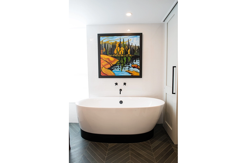
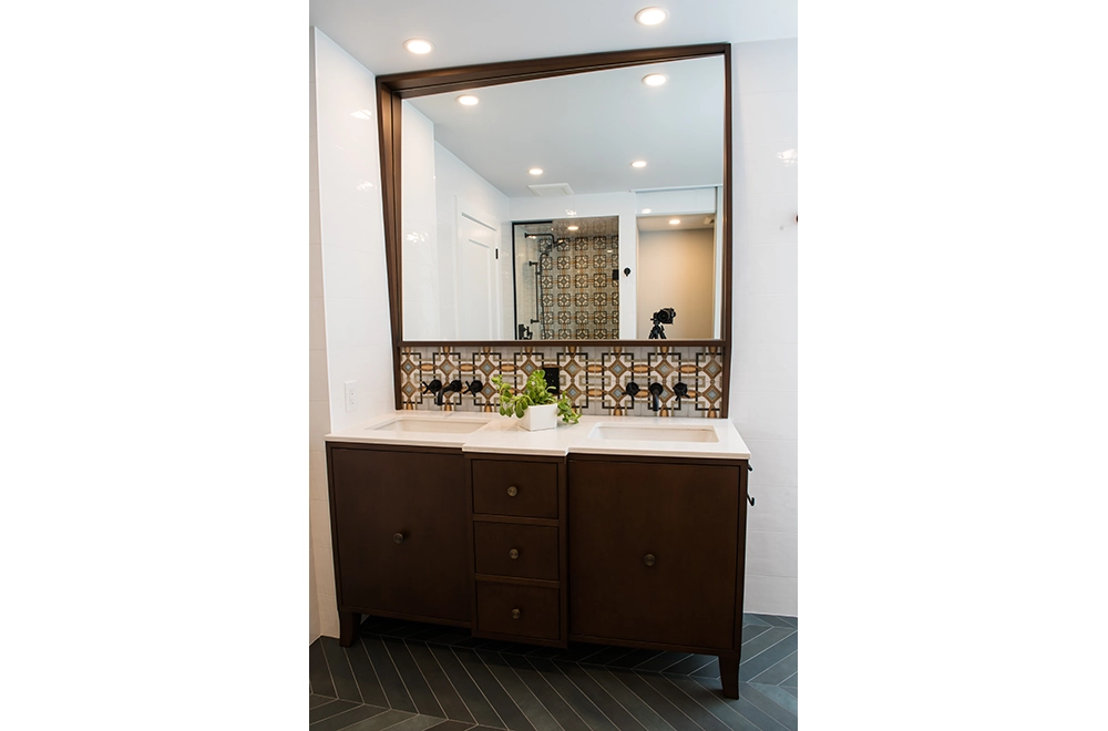
The existing bathroom had separate vanities and the new design featured double sink vanity. As well, the current built-in tub was to be replaced with a free-standing style and was to be shifted over as much as possible to create some symmetry in the room and visual appeal, as well as creating the extra space required for the double vanity. The water closet room was to remain as is in terms of its location. The original shower was accessed through the water closet room. It was very dark and tight given that they had an entry door to the shower as well as the room itself. The new design changed the access point for the shower to off the main bathroom and left the water closet room on its own. To save functional space the swing door into the water closet space was removed and a concealed hardware sliding door was installed.
A beautiful custom furniture walnut vanity was built complete with mirror featuring a Quartz countertop. The free-standing soaker tub was installed over a custom curved Corian base and was accented with a floor mounted tub filler. Custom solid wood shaker doors for the entry to bathroom and water closet room where installed. An accent tile was installed on 1 shower wall and the backsplash of the vanity. The 8” x 8” accent tile was selected to compliment a prized piece of art that the client wanted to showcase over the free-standing tub. WCM installed large porcelain tile in a classic herring bone pattern as the floor tiles for the main area.
The main challenge of this project was the tub plumbing. In order to adjust the location of the plumbing we had to get permission from the building management to cut the top of the concrete slab in order to run our tub drain to the new location with specifications from an engineer. The plumbing change created the next issue which was how to conceal the drain pipe that was extended from original tub location to the new location. The tub was placed on a frame built to run the new line. The piping was concealed with the custom curved Corian piece, colour matched with the floor.


