Additions / Renovations
LEASIDE, HOME ADDITION AND RENOVATION
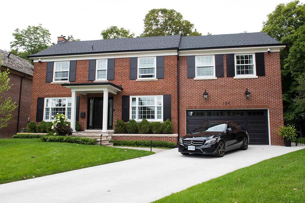
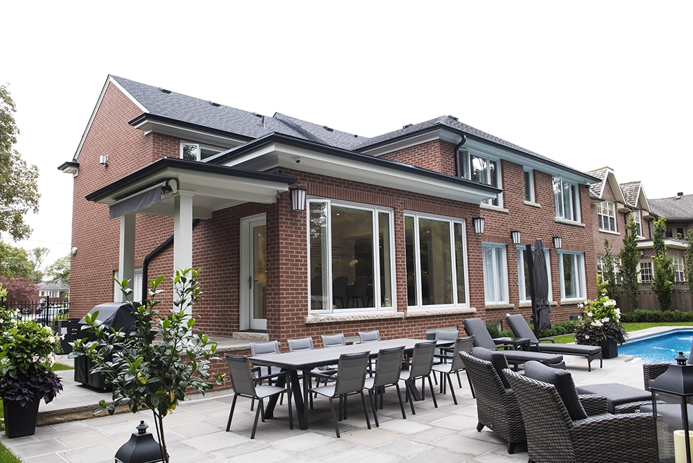
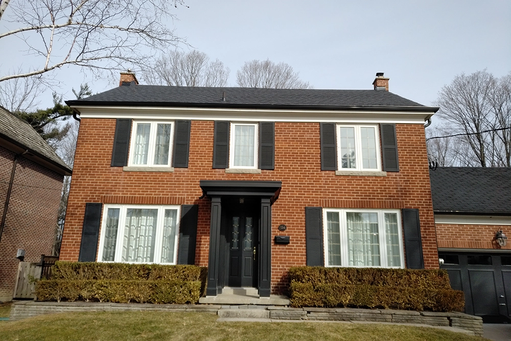
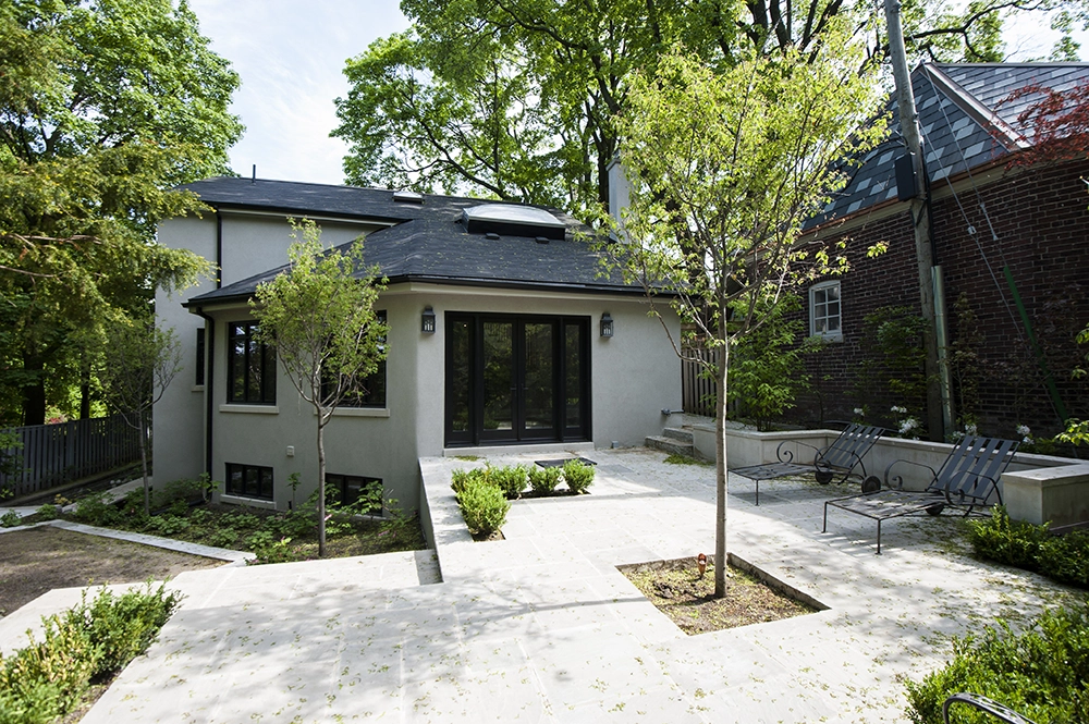
The 1940’s Leaside home had seen several renovations in its past. The current homeowner had been in the house for almost 20 years and felt it was time to update and improve the homes core function. Empty nesters now, they still wanted to make sure that when kids and company were in town that they could accommodate comfortably. Entertaining was also important and with a growing family of grandkids and extended family, the current house would be difficult to serve this.
The goals of the renovation were to:
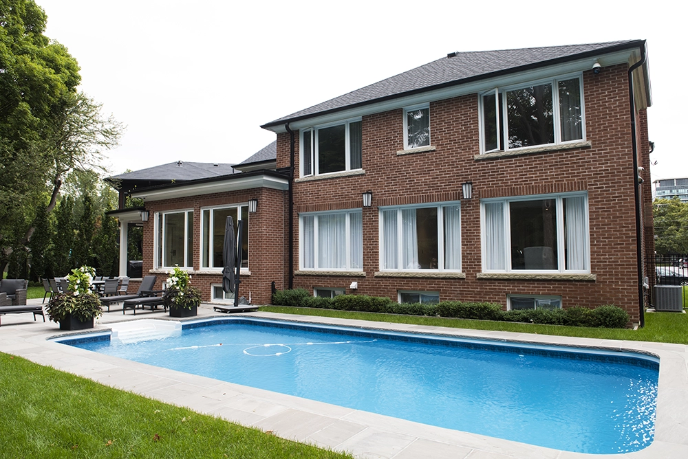
Design and build an addition to the rear of the house on the east side that would function as a large eat in Kitchen with great connection to the backyard ravine oasis, with alterations to the Main floor to allow for a larger dining room.
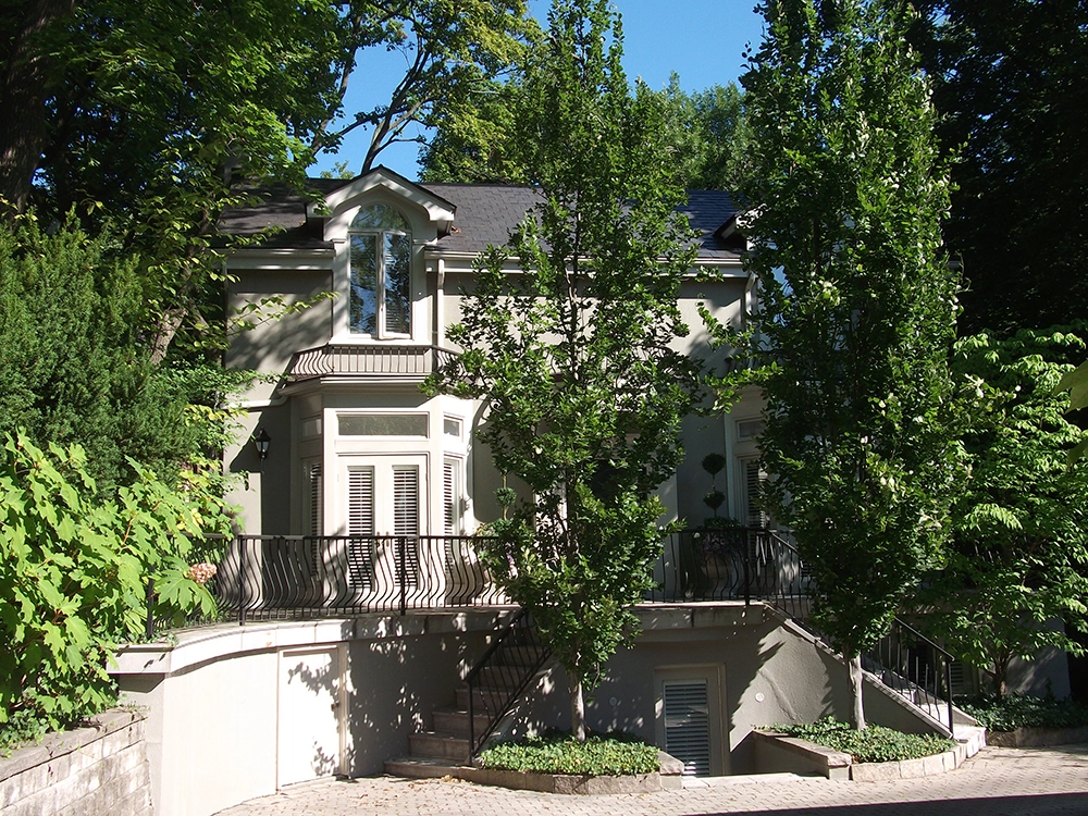
Second floor addition above the garage to function as a large family room and office.
Upgrade all Mechanical equipment including snow melting to all walk and driveways.
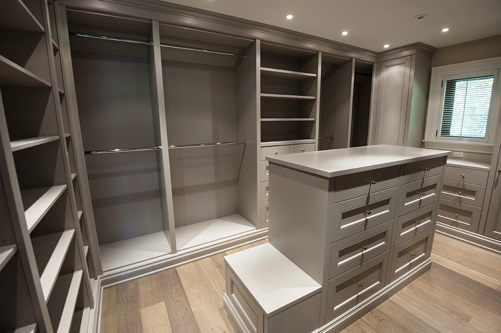
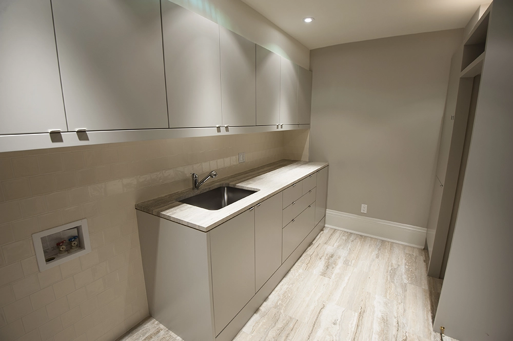
Maximize Storage space and improve the current laundry facilities.
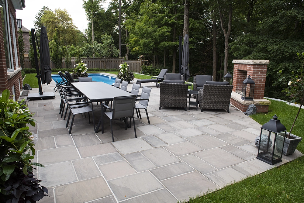
Improve the current Landscape features at both the front and the rear of the house.
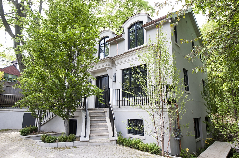
The exterior facade to be in keeping with the time the house was built.
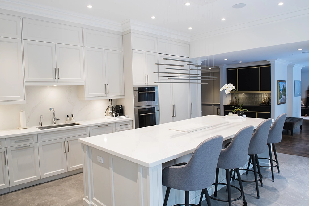
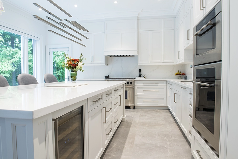
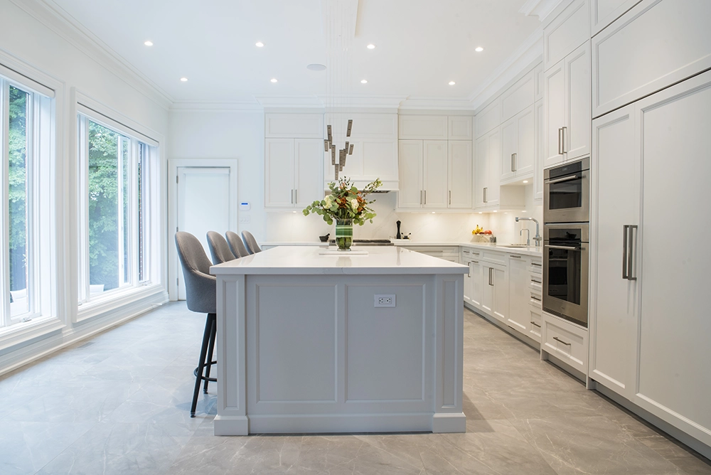
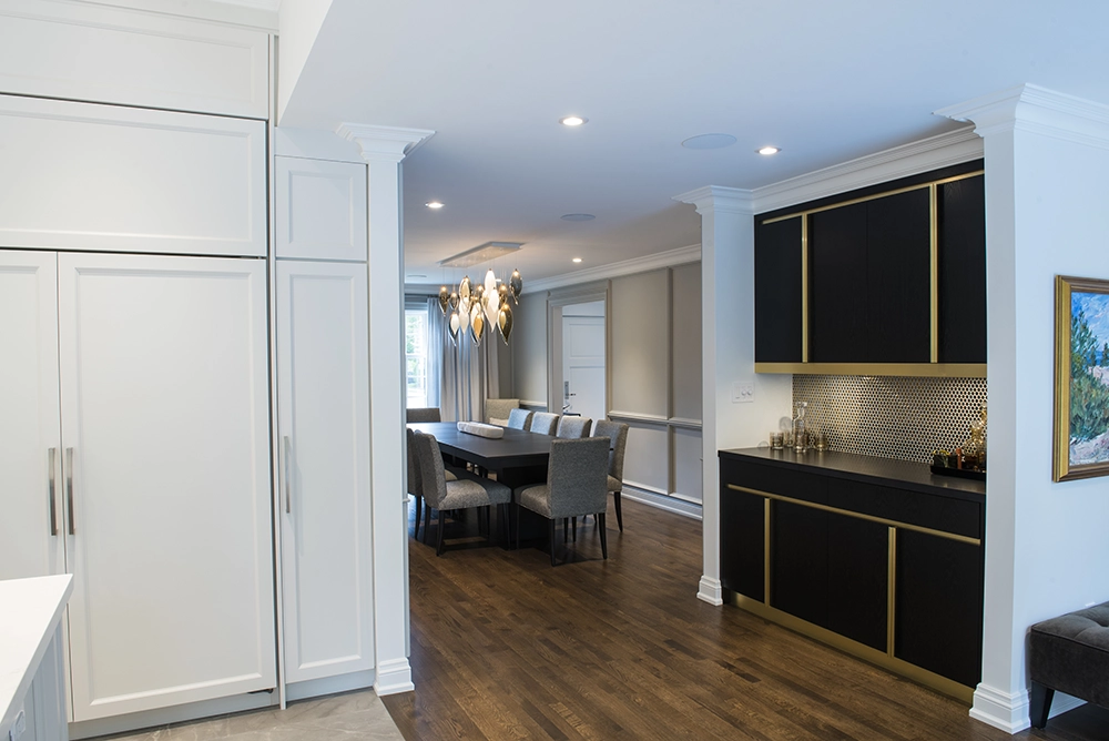
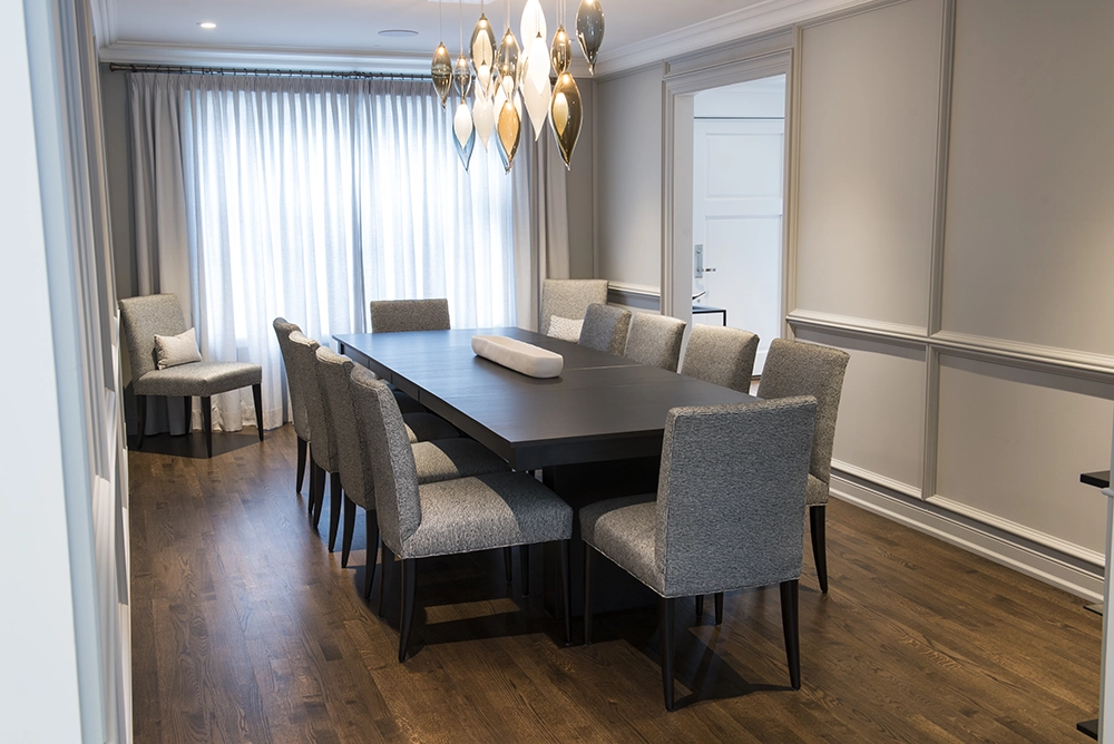
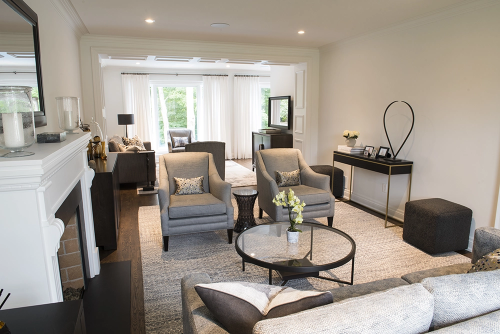
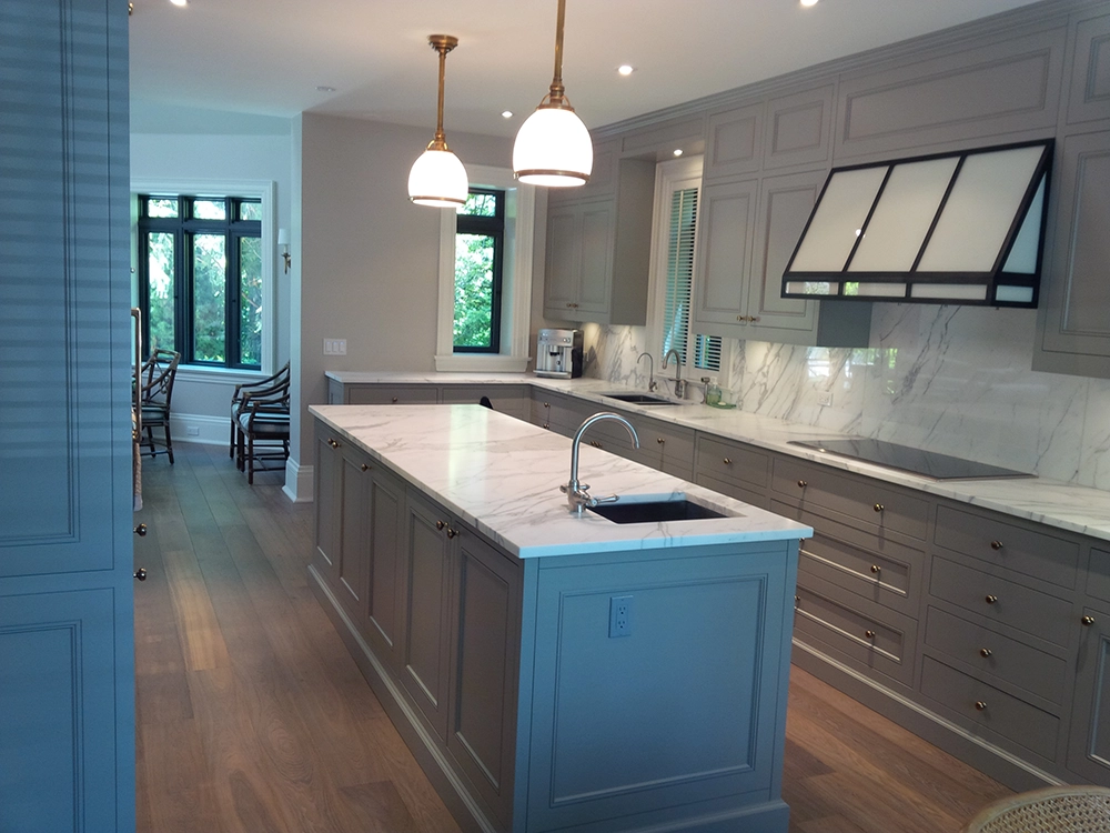
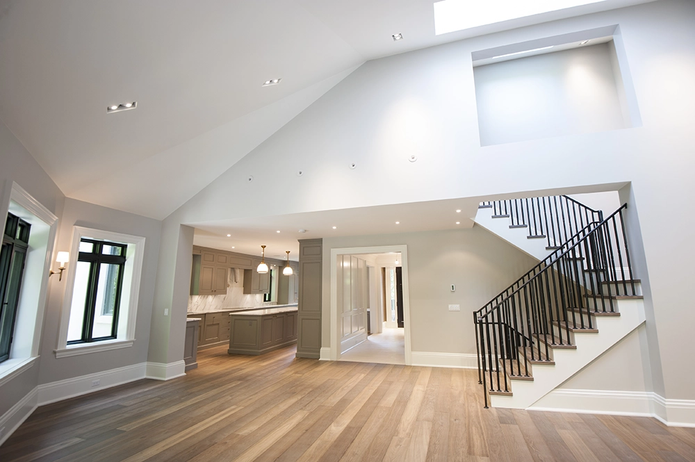
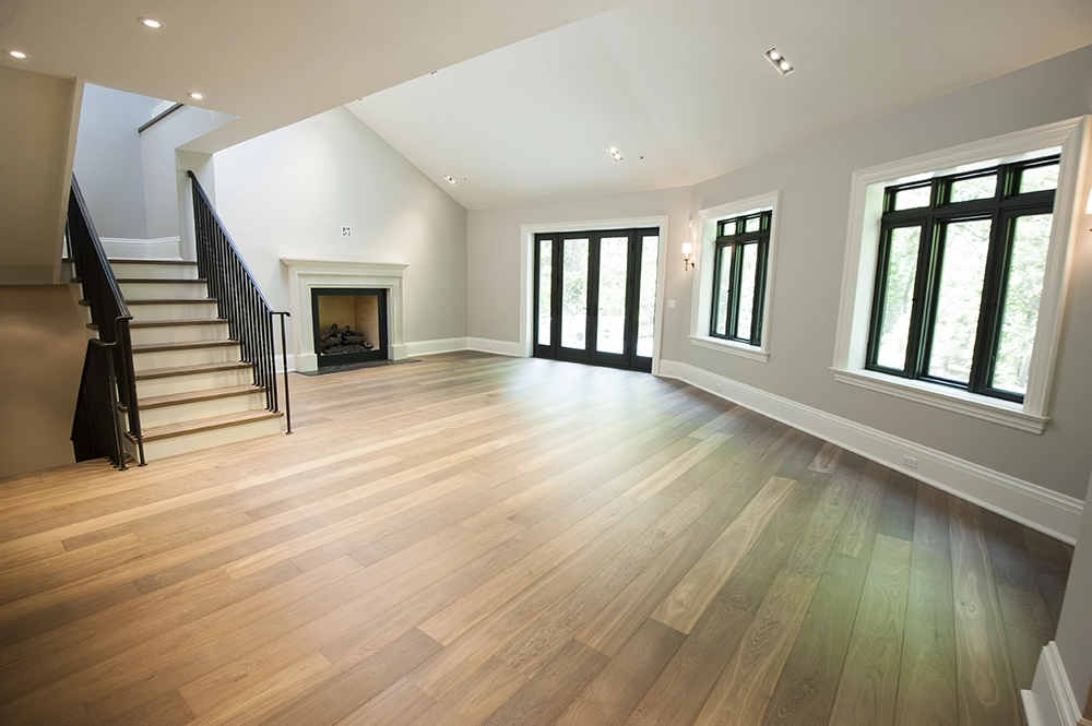
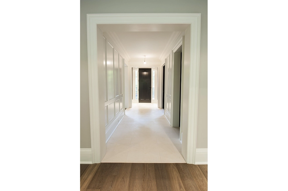
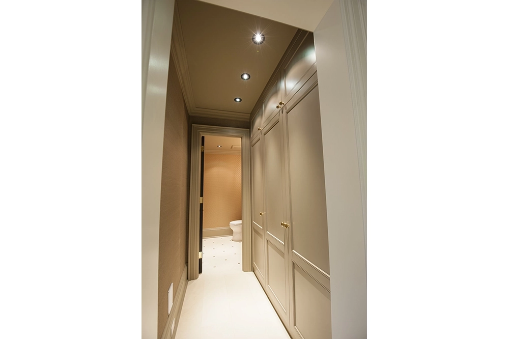
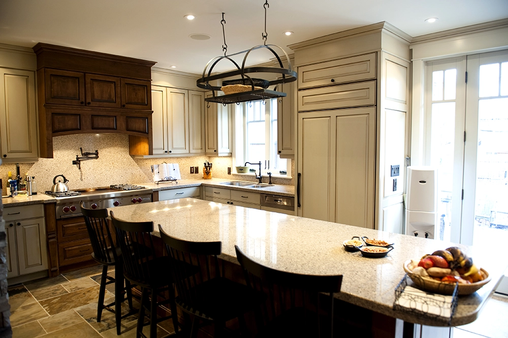
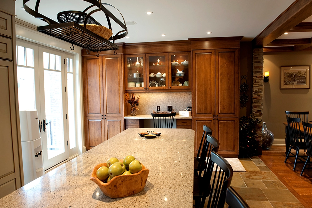
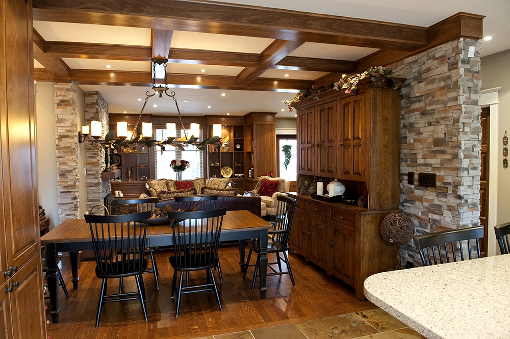
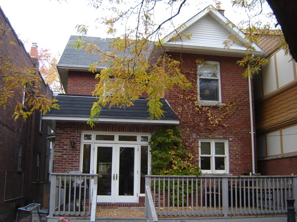
To achieve their goals, the existing garage had to be removed to build the new design calling for additional width and depth. On the main floor, the existing house plan had a small dining room near the front and galley style kitchen. The new plan placed the kitchen in the rear of the addition. In doing so, the dining room took over the original Kitchen space to allow for seating of up to 16 people comfortably. The additional space also provided a location to create a servery between the Dining and Kitchen areas. The connection between the exterior and the kitchen was enhanced by 10’-0” ceilings and tall windows to bring in the ravine views. Other features include Custom painted cabinetry accompanied by a 10’-0” island with quartz countertops, installed over 2’x4’ porcelain tiles. Oversized upper cabinets with notable kitchen accessories including pocket doors to hide a TV, pull out ladder stored in the toe kick, drawer and corner organization enhanced the Kitchen’s function. The light color palette was accented by the black and gold servery that leads you from the Kitchen into the Dining room. Contemporary wall mouldings incorporated with crown details matched to the existing house, connect all areas of the main floor. Hardwood floors were fully refinished and stained dark to compliment the colour palette.
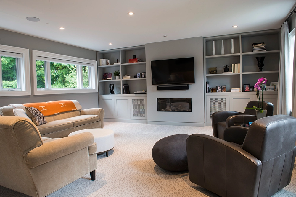
Above the Garage, the second-floor addition created a large Family room accessed through the new office, originally used as a bedroom. Custom cabinetry adds storage and a modern feel to the gas fireplace, creating warmth and entertainment in the bright space.
The addition enhanced the homes storage, laundry, and mechanical areas, providing better function to the homeowners. New LED pot lighting was installed throughout the house, along with new home smart features and security system including cameras.
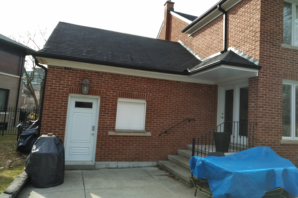
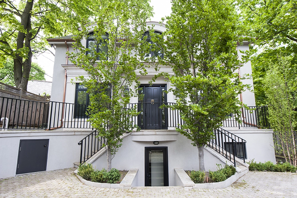
Exterior renovation features included new front and side porch entries with overhangs, new windows and doors to the addition and front of house, new flagstone patios to the front, side and rear of the home, combined with a new retaining wall to stop erosion, and an outdoor fireplace. All walkways and the concrete driveway were equipped with snowmelting. The new addition brick was tinted to match original house as close as possible.
SOUTH ROSEDALE HOME ADDITION AND RENOVATION - SARA BELLAMY DESIGNER
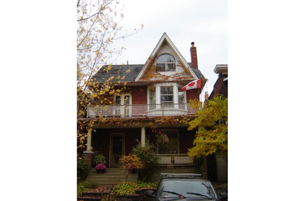
The Clients of the 1927 Beaches house were facing challenges for daily life needs of a growing family. The challenges being low functionality of the spaces for daily living needs coupled with conditions requiring constant repair / maintenance.
Client’s goal was to ‘’Make the space creative and functional to suit their needs within the same footprint on the property ‘’ and ‘’Enhance lifestyle and overall comfort level’’.
The Renovation:
Though all areas of the house have undergone successful renovation for functionality, aesthetic and comfort equally, the following are highlights:
Basement:
Ceiling height of 6’-3” and small space for recreation was limiting factor. We achieved desired functionality by underpinning to gain an 8’-6” ceiling height, as well as expansion to floor plate with an addition under front porch for Exercise and Music rooms and digging out an existing crawl space for a new walkout creating a Mud room. Other defined spaces included 3 pc. Bathroom, Mechanical room, small workshop, and large Recreation space.
Main Floor:
The open concept original space with poor definition as to which room was which lacked balance for function, interaction, and aesthetic.
Floor was space planned with a change of stair location to create a wider Entry foyer with ample storage closets. Fire place is the focal point of Living room, Dining is bigger with modified Bay window also defined by ceiling feature. Redesigned Kitchen with Eat in function allows for more better storage and efficiency.
Exterior / Addition / expansion:
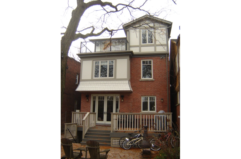
Additions on the 2nd and 3rd floors are carefully crafted not only to enhance the Architecture but also provides space efficiency to its respective function.
2nd Floor – 3 equal sized Bedrooms with large closets, open concept Office with access to balcony, Laundry room, 4 pc. Bathroom and Mechanical room.
3rd Floor – His and Her’s walk in closets, extra built in storage space, addition to rear of house accommodates 5 pc. Ensuite Bath (original 2 separate bathroom were not functional), walk out terrace, and large sleeping area.
Though all areas of the house have under gone successful renovation for functionality, aesthetic and comfort equally, the Ensuite Bathroom seeks attention.
3rd Floor – the original space was 2 separate bathroom areas having a tub and a sink at one place and toilet and a sink at the other place, which did not make sense for its functions as unified Bathroom or for the Master Suite space plan.
Proposal of New addition to rear of house to accommodate full Ensuite and terrace not only provided domain for the Ensuite but also enhanced functionality to the suite.
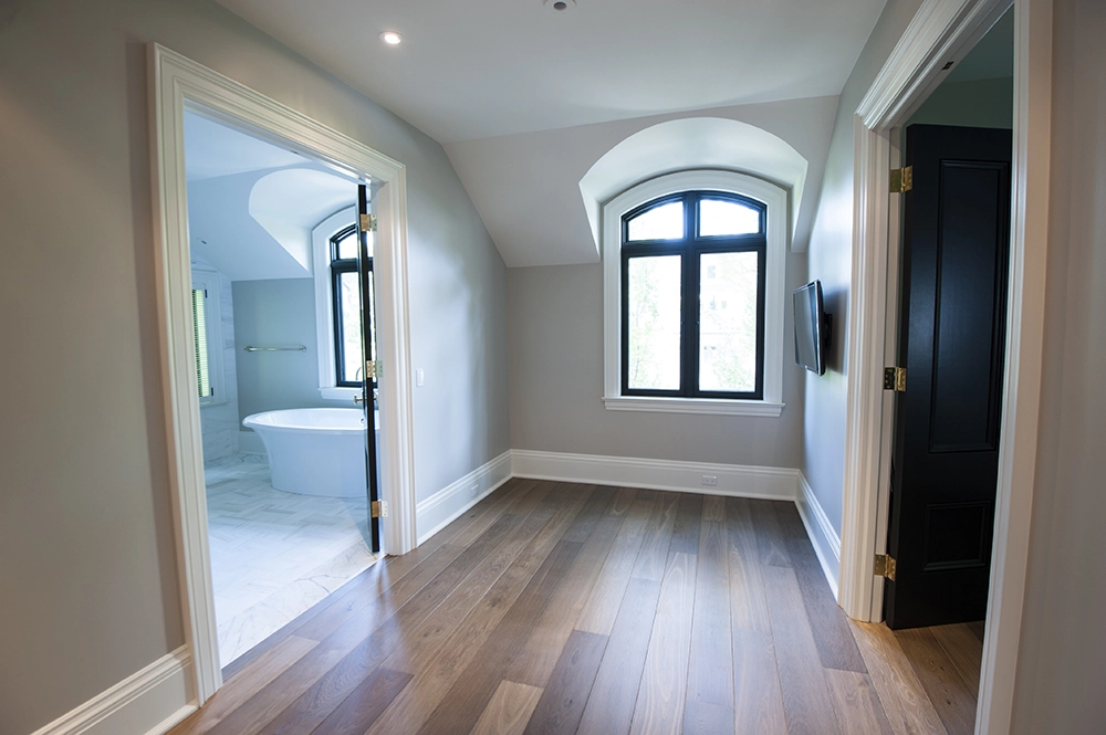
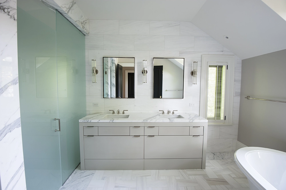
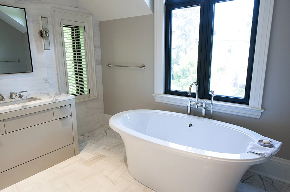
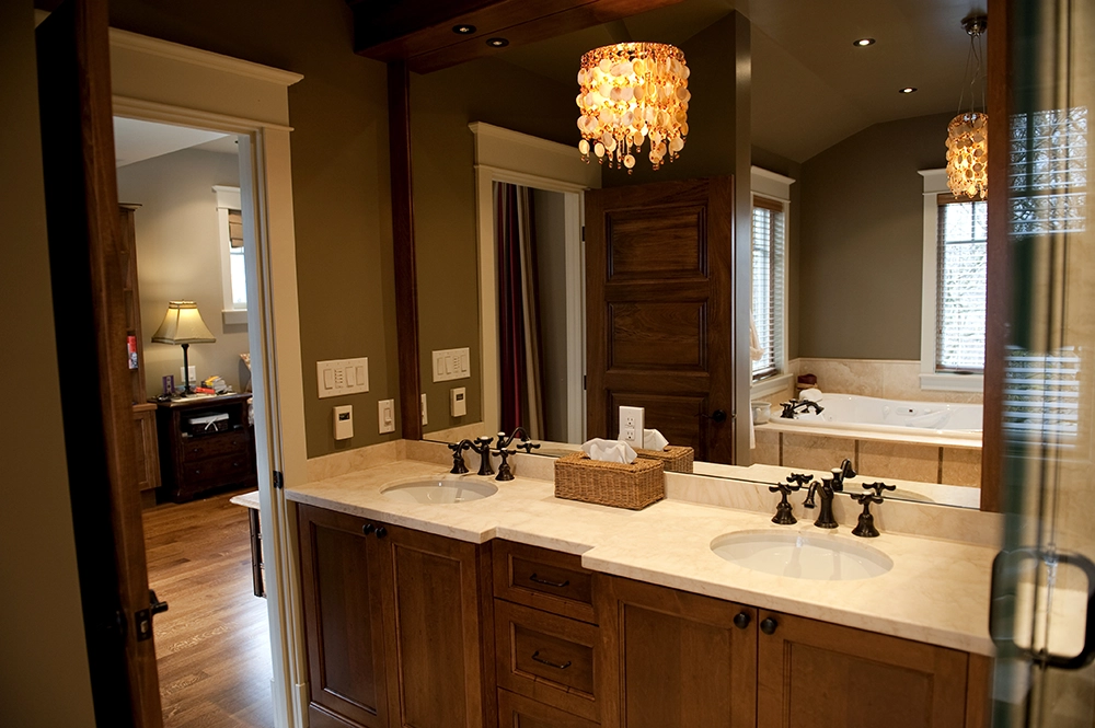
5-pce. Ensuite Bath features transitional design with a vanity for 2 under mount sinks, shower and 2 person whirlpool tub. Dark tone of the wall paint provides contrast to highlight Limestone floor with accent strips as well as the shower walls. The pendent light fixture as opposed to conventional wall sconces is a creative twist adding to the warm ambience.
The Ensuite functions are also expanded for additional storage and display niche adding to aesthetic appeal. The windows around the whirlpool tub provide the view for a more relaxed feel.
Overall, the space planning, selection of materials, color scheme and plumbing fixtures coupled with design elements makes this Ensuite Bath creative and functional for Client’s needs and comfort level.
This renovation was part of an entire house remodeling project.
Original ceiling height of 6’-3”, along with small recreation space, an oversized Mechanical and Laundry rooms, as well as an underutilized crawl space where a 1990’s addition was built were the limiting factors. We achieved desired functionality by lowering the basement to provide 8’-6” ceiling height and expanded the floor plan by adding a mud room and walkout through digging out the crawlspace. Other new space was realized through building an addition under the original Front Porch to give them an Exercise room and soundproof Music room. By moving the Laundry to the 2nd floor, other space was gained to provide more storage, a 3-pc. Bathroom and an efficient sized Mechanical room. Custom cabinetry steals the attention for this level in addition to small perks like a Dog shower and tool storage coral.
AVENUE RD, HOME ADDITION AND RENOVATION
Winner of Best Renovation (No Addition): Under $300,000
Building Industry and Land Development Association (BILD) / Renomark – 2022
This 3-storey town house was built in the 1980’s in downtown Toronto. The main floor of the town house was built on a concrete slab which separated it from the Retail space below.
There was no ability to add space to its existing footprint.
The townhouse is located on a busy street made access to the entry point more difficult.
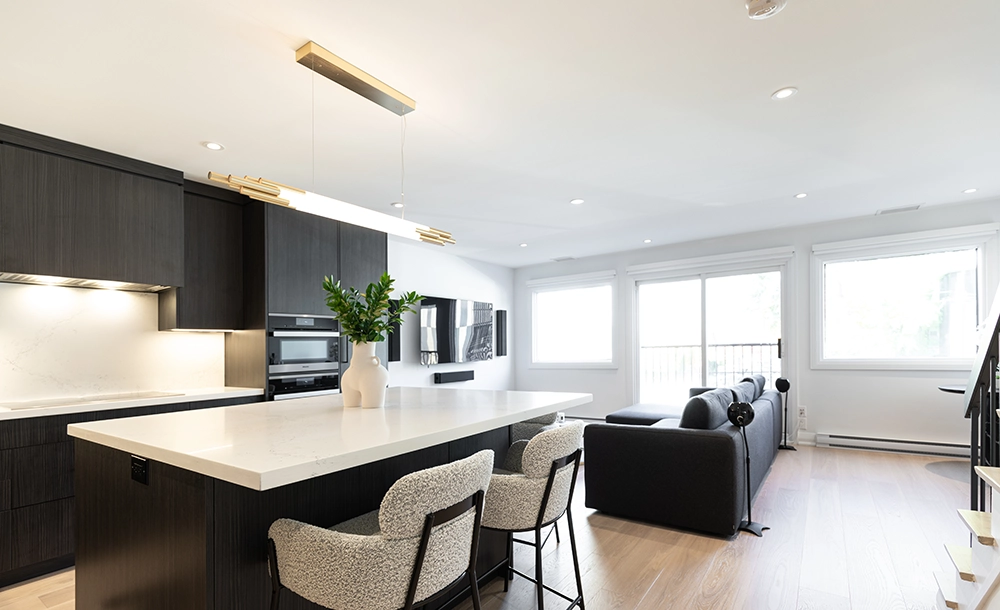
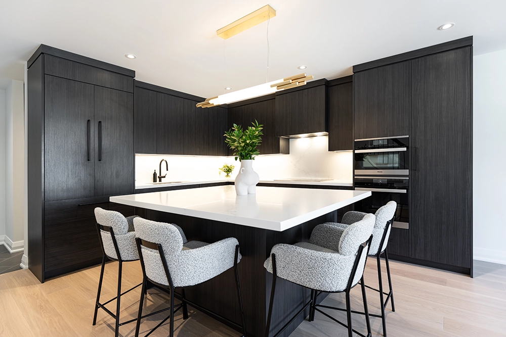
Design details that helped create a harmonious palette throughout for Flooring, Cabinetry, Countertops, Backsplash, Lighting and Accessories included the following:
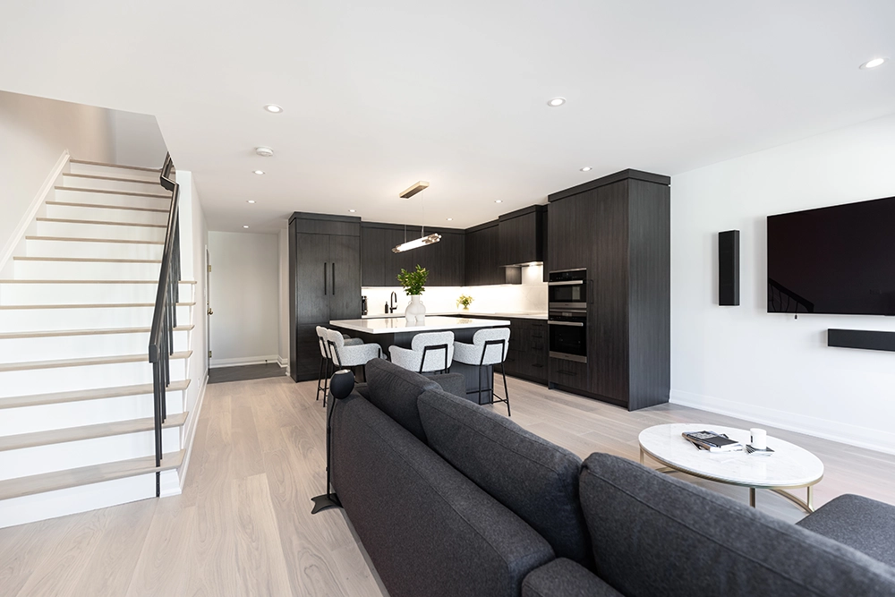
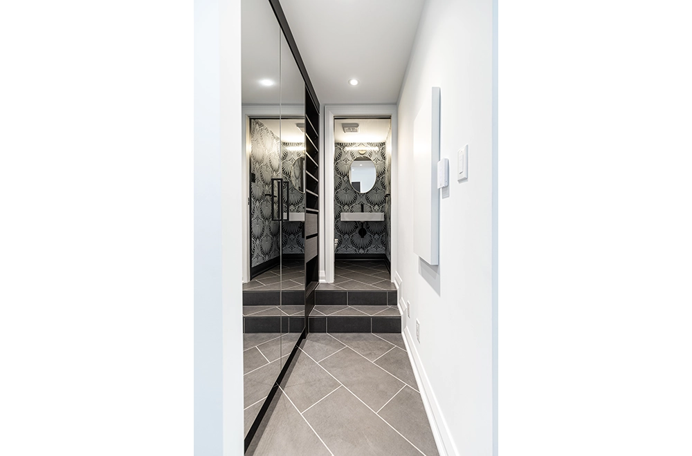
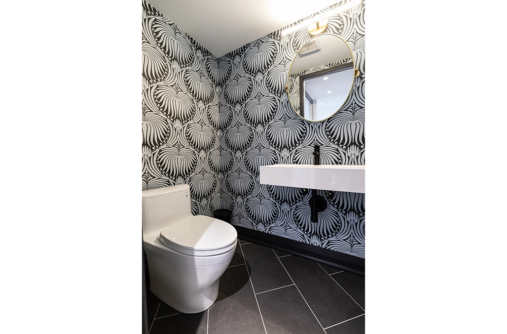
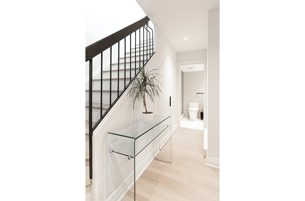
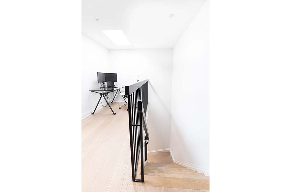
From the main entry, 12’x24’ off black porcelain tiles were laid in a diagonal offset leading patter taking you into the storage area and private powder room. For the rest of the house except Ensuite Bathroom the flooring was a wide plank, neutral grey stained oak. The original stairs were covered in carpet but luckily there was oak underneath so they could be refinished to match the new flooring.
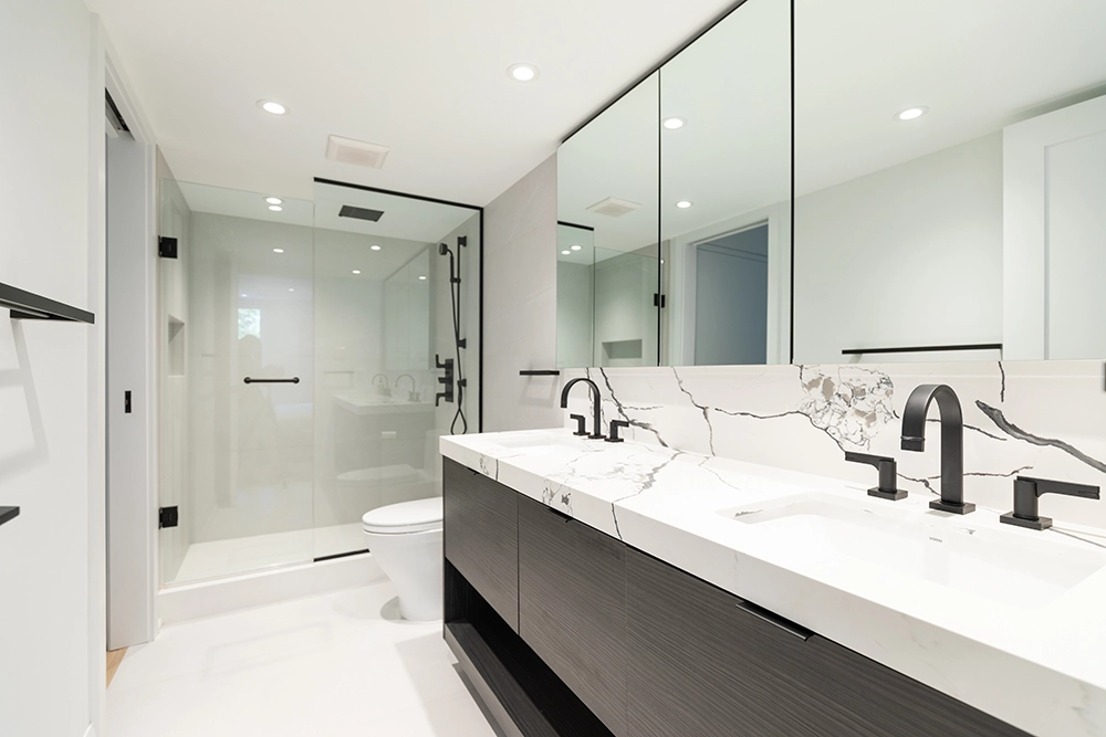
The Ensuite Bathroom was finished in large format porcelain tiles using the same on the floor and in the shower.
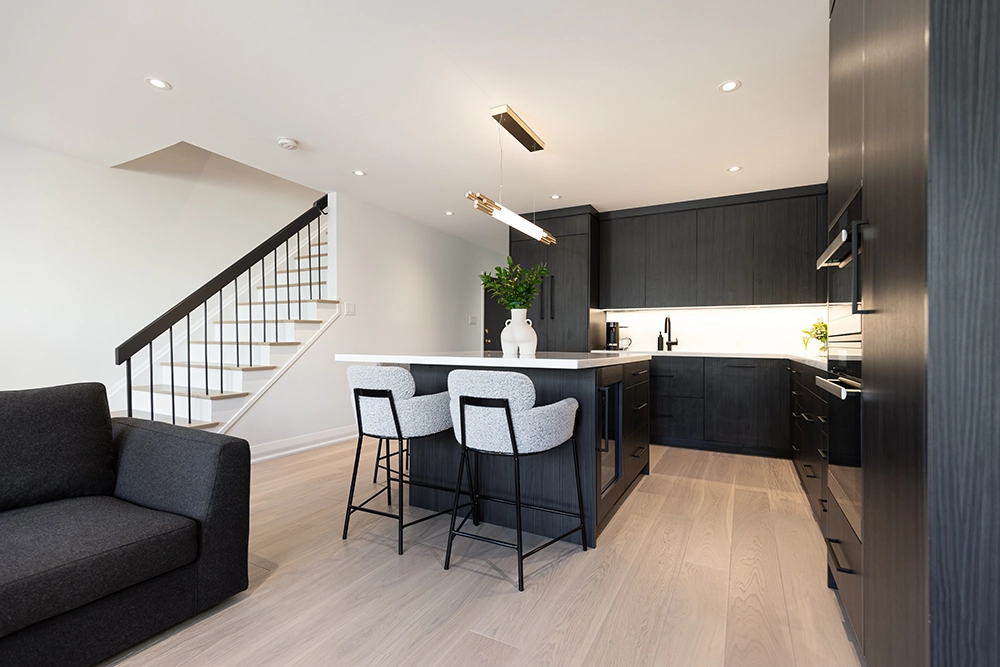
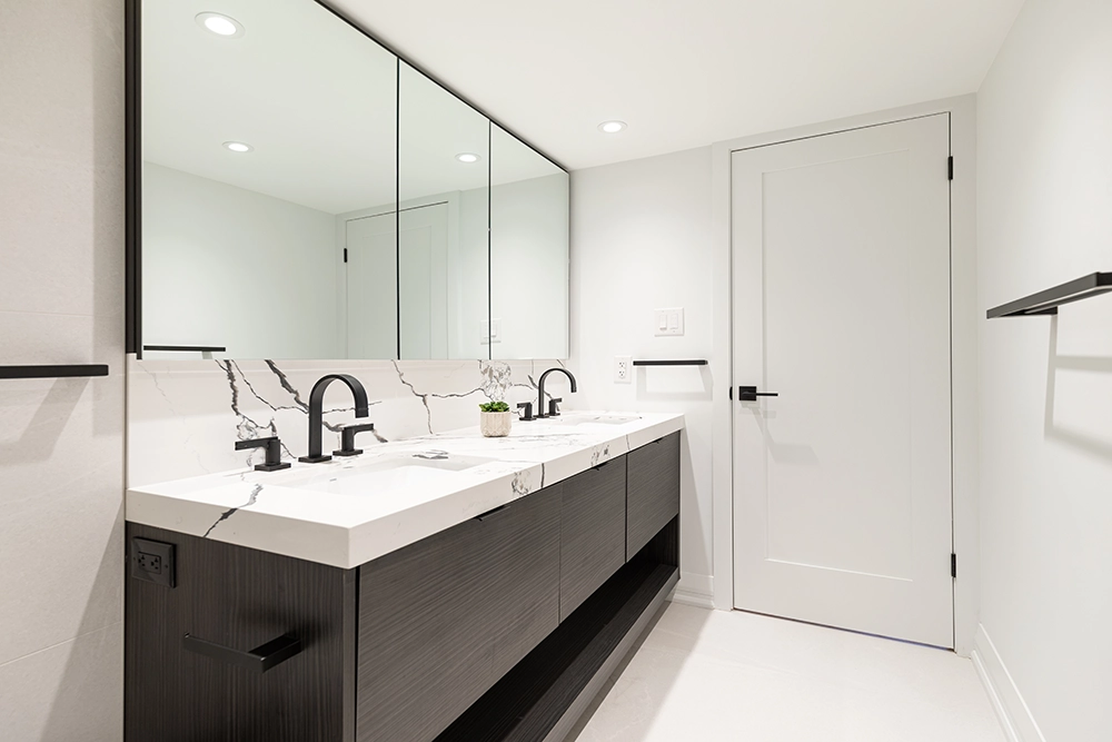
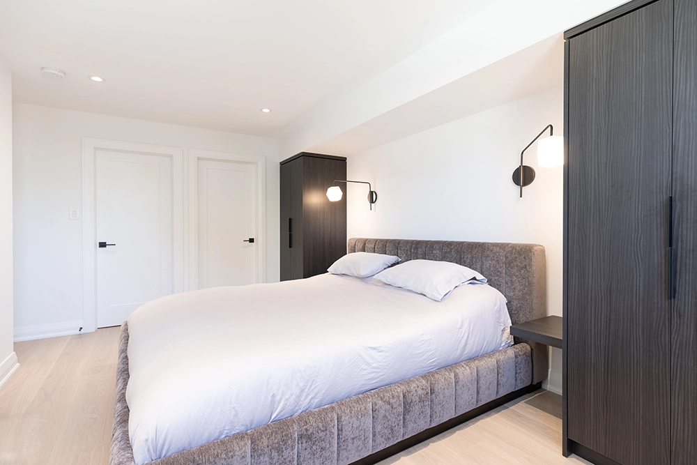
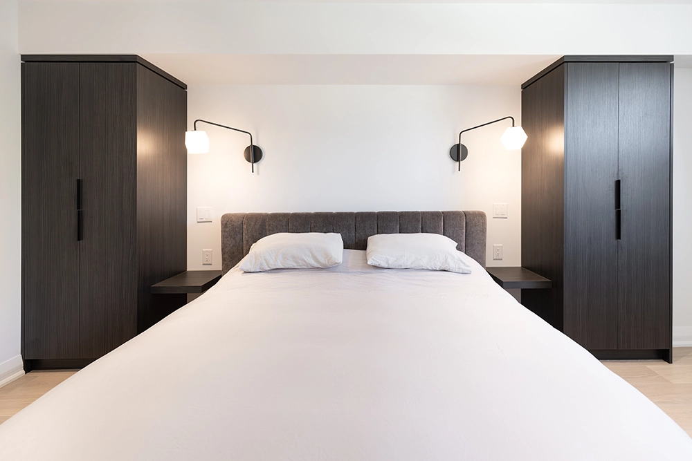
Cabinetry throughout was custom made using a high-end, high performance laminate by Decotec with an off black oak stained finish.
Countertops and backsplashes were quartz in both the Kitchen and Ensuite Bathroom.
Modern shaker panel doors with matching trim work for baseboards, door and window casings helped continue the new look throughout.
LED pot lighting was used throughout the entire house with accent lighting in designated areas. Undercabinet lighting was also used in the kitchen. Lutron Caseta dimmers and switches were used for smart controlling of lighting throughout.
The colour palette was balanced by using 3 tones of colour, off white on the walls, darker tone on the cabinetry and mid tones on most of the flooring, creates balance in the new space.
Black and Gold accents for light fixtures, plumbing fixtures, Door hardware and railings helped unify and pull all 3 levels of the town house together.
To create a better functioning house, the following steps were taken:
All the finishes throughout, and all framing on the main and second floors were removed. There were no load bearing walls.
To add the powder room on the main floor, we connected to a close by plumbing stack and raised the floor for the powder room, to accommodate the toilet.
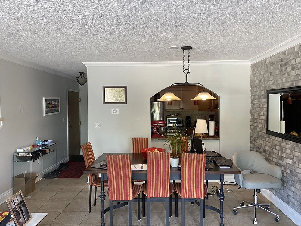
In the pre-renovation plan, the closet on the right side entry into the kitchen housed the electrical panel. The main feed for the electrical panel came through the slab from below and its location was off from our new wall layout. We had to arrange for permission with retail owner below to move the electrical service to locate the panel in the new wall dividing the kitchen space from the front entry and powder room. This along with the raised floor for the plumbing were the keys to accomplishing the client’s goals for the main floor.
With this new space plan, it made you feel like there was an addition put on the house without adding any space.
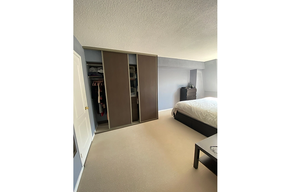
On the second floor, we got rid of the powder room and original ensuite bathroom shower to create a walk in closet for the primary bedroom.
The spare bedroom stayed the same except for creating a more useful closet that stored components for the client’s audio and network equipment.
In the primary bedroom, we built wardrobes with side tables on either side of the bed.
With adjustments made to wall locations, we were able to create space for a 7’ double sink vanity and medicine cabinet storage.
The original closet with a bifold door that housed the hot water tank and stackable washer, and dryer was reworked with a much larger opening and 2 custom doors to access the space.
BEACHES, HOME ADDITION AND RENOVATION
Most Outstanding Home Renovation: Over $500,000
ONTARIO HOME BUILDERS ASSOCIATION – 2010
The Clients of the 1927 Beaches house were facing challenges for daily life needs of a growing family. The challenges being low functionality of the spaces for daily living needs coupled with conditions requiring constant repair / maintenance.
Client’s goal was to ‘’Make the space creative and functional to suit their needs within the same footprint on the property ‘’ and ‘’Enhance lifestyle and overall comfort level’’.
The Renovation:
Though all areas of the house have undergone successful renovation for functionality, aesthetic and comfort equally, the following are highlights:
Basement:
Ceiling height of 6’-3” and small space for recreation was limiting factor. We achieved desired functionality by underpinning to gain an 8’-6” ceiling height, as well as expansion to floor plate with an addition under front porch for Exercise and Music rooms and digging out an existing crawl space for a new walkout creating a Mud room. Other defined spaces included 3 pc. Bathroom, Mechanical room, small workshop, and large Recreation space.
Main Floor:
The open concept original space with poor definition as to which room was which lacked balance for function, interaction, and aesthetic.
Floor was space planned with a change of stair location to create a wider Entry foyer with ample storage closets. Fire place is the focal point of Living room, Dining is bigger with modified Bay window also defined by ceiling feature. Redesigned Kitchen with Eat in function allows for more better storage and efficiency.
Exterior / Addition / expansion:
Additions on the 2nd and 3rd floors are carefully crafted not only to enhance the Architecture but also provides space efficiency to its respective function.
2nd Floor – 3 equal sized Bedrooms with large closets, open concept Office with access to balcony, Laundry room, 4 pc. Bathroom and Mechanical room.
3rd Floor – His and Her’s walk in closets, extra built in storage space, addition to rear of house accommodates 5 pc. Ensuite Bath (original 2 separate bathroom were not functional), walk out terrace, and large sleeping area.
Though all areas of the house have under gone successful renovation for functionality, aesthetic and comfort equally, the Ensuite Bathroom seeks attention.
3rd Floor – the original space was 2 separate bathroom areas having a tub and a sink at one place and toilet and a sink at the other place, which did not make sense for its functions as unified Bathroom or for the Master Suite space plan.
Proposal of New addition to rear of house to accommodate full Ensuite and terrace not only provided domain for the Ensuite but also enhanced functionality to the suite.
5-pce. Ensuite Bath features transitional design with a vanity for 2 under mount sinks, shower and 2 person whirlpool tub. Dark tone of the wall paint provides contrast to highlight Limestone floor with accent strips as well as the shower walls. The pendent light fixture as opposed to conventional wall sconces is a creative twist adding to the warm ambience.
The Ensuite functions are also expanded for additional storage and display niche adding to aesthetic appeal. The windows around the whirlpool tub provide the view for a more relaxed feel.
Overall, the space planning, selection of materials, color scheme and plumbing fixtures coupled with design elements makes this Ensuite Bath creative and functional for Client’s needs and comfort level.
This renovation was part of an entire house remodeling project.
Original ceiling height of 6’-3”, along with small recreation space, an oversized Mechanical and Laundry rooms, as well as an underutilized crawl space where a 1990’s addition was built were the limiting factors. We achieved desired functionality by lowering the basement to provide 8’-6” ceiling height and expanded the floor plan by adding a mud room and walkout through digging out the crawlspace. Other new space was realized through building an addition under the original Front Porch to give them an Exercise room and soundproof Music room. By moving the Laundry to the 2nd floor, other space was gained to provide more storage, a 3-pc. Bathroom and an efficient sized Mechanical room. Custom cabinetry steals the attention for this level in addition to small perks like a Dog shower and tool storage coral.
EAST WOODBRIDGE, HOME ADDITION AND RENOVATION
A bungalow built in the early 1980s, the client was looking to modernize the home to improve its functionality, efficiency, and overall appearance. The initial concepts involved adding different styles of additions. In the end, the square footage of the home was suitable for this family of four, and what they really needed and wanted was better use of the existing space.
The critical areas to be addressed were the kitchen, adding an ensuite bath, updating the main floor bath, creating a larger more functional laundry room and renovating the basement. Other improvements that the homeowner required was new lighting and electrical, efficient HVAC equipment and updated windows and doors.
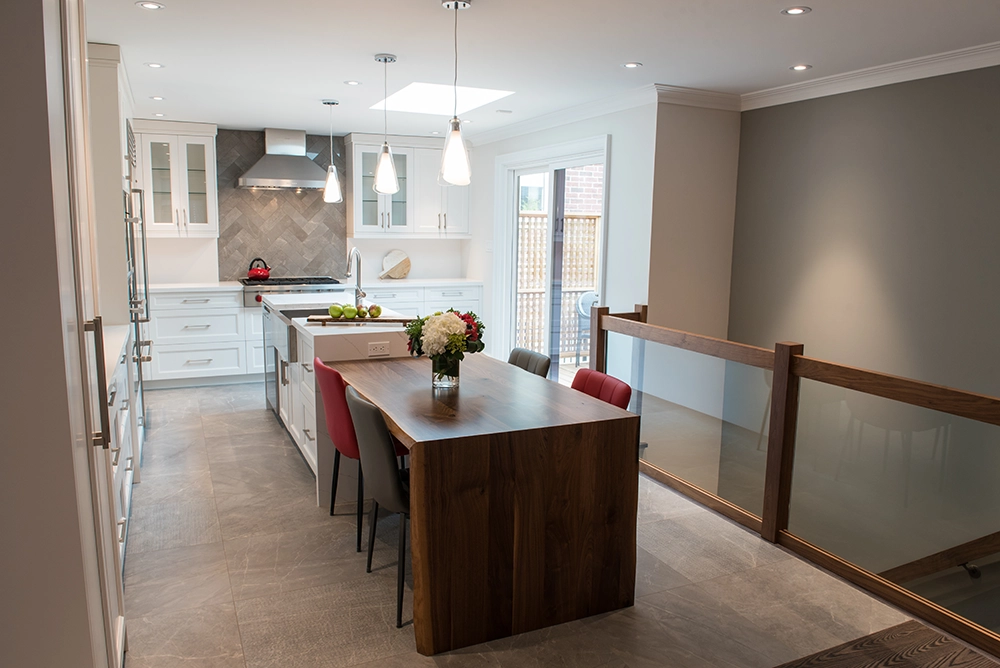
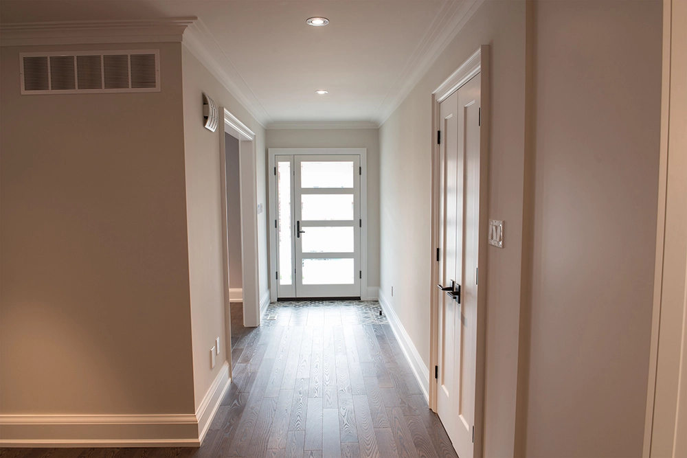
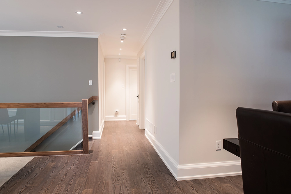
Several main floor walls were removed to create an open-concept design between the kitchen, hallway and dining room. The stairs were reconfigured from a switchback stair to a single-flight stair which increased the usable floor space, created room for the new ensuite bathroom and helped provide an additional storage room in the basement. The main floor received new engineered hardwood flooring, decorative crown mouldings, new clean contemporary doors, and trim was also installed to elevate the style of the home.
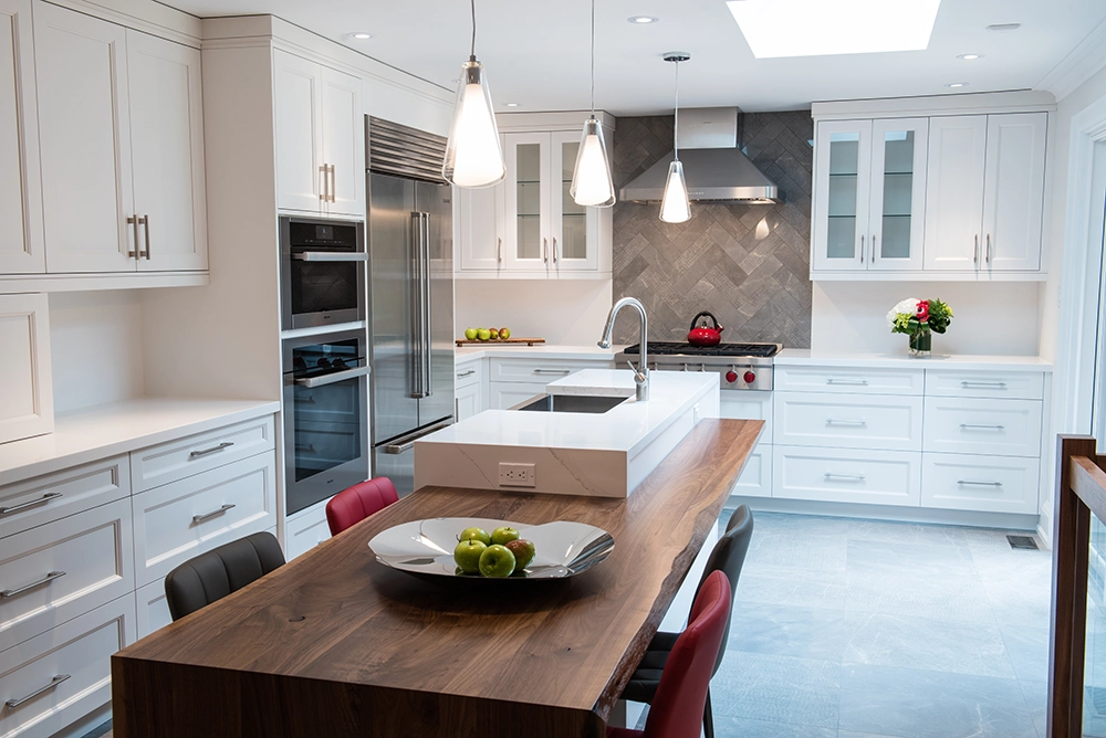
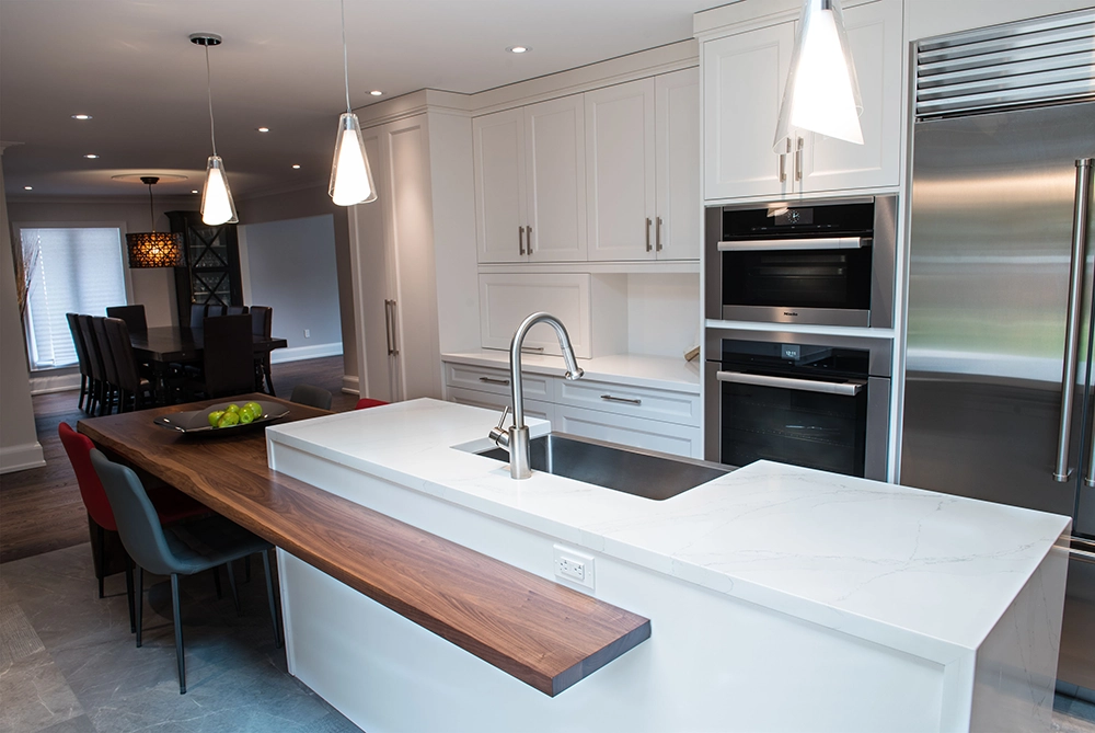
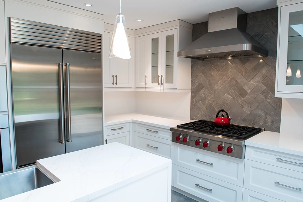
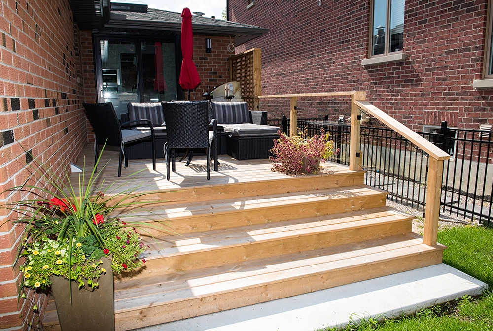
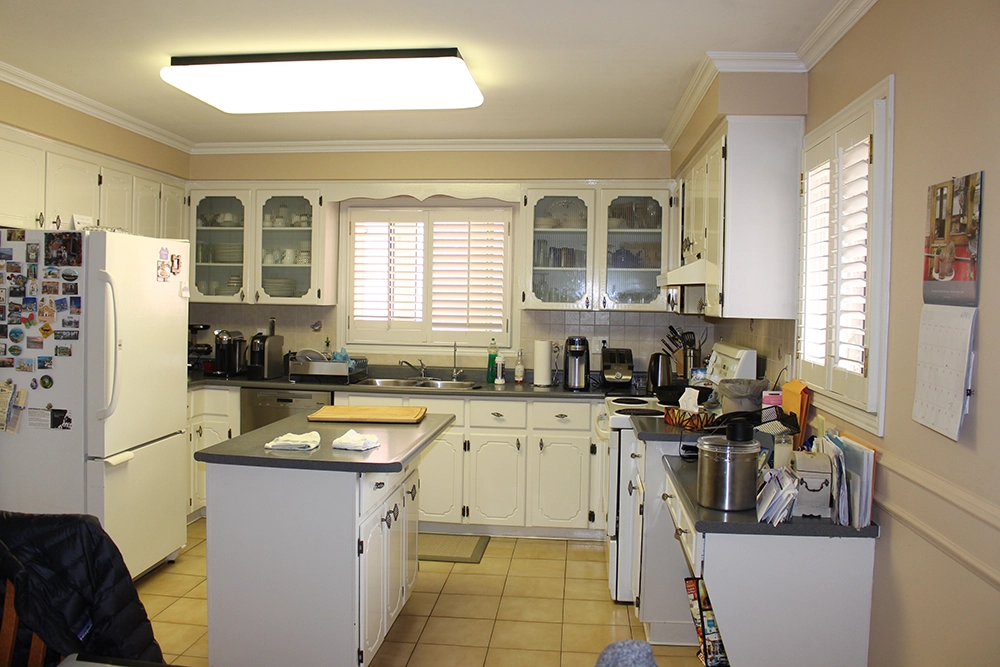
The existing kitchen area was updated to an L-shaped design, featuring a large island flowing into a walnut dining table. A cabinetry wall with custom units provides ample storage, and durable quartz was installed on the countertops and backsplash. New kitchen floor tile was installed and used as the range backsplash in a chevron pattern creating a beautiful feature. The kitchen also received new light and life from the addition of a skylight. A new sliding door was installed in the kitchen providing quick access to a cozy new deck and the large backyard, plus a beautiful view.
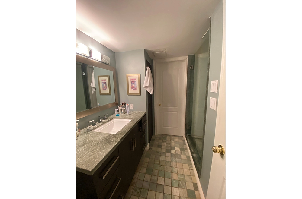
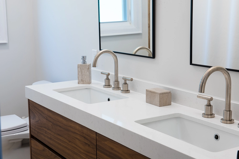
The existing bathrooms on the main floor and basement received a full renovation with new beautiful and functional vanities with ample storage, and quartz countertops. Low-maintenance porcelain floor and wall tiles were selected with glass shower surrounds and new accessories to provide a modern look.
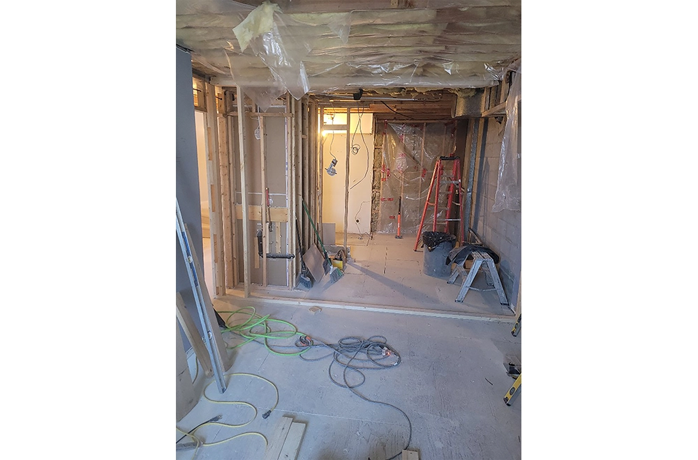
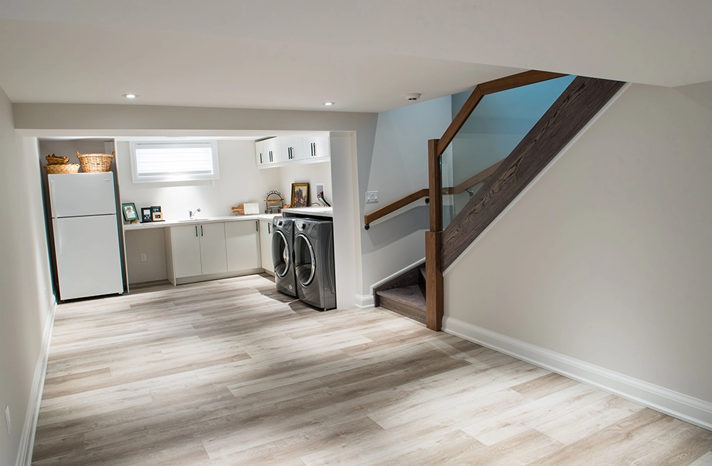
In the basement, an old kitchen was removed and replaced with a larger more functional laundry facility, a storage room was built and the mechanical room was updated for the new equipment. New flooring, doors and trim were installed, making the basement an inviting space for work and play.
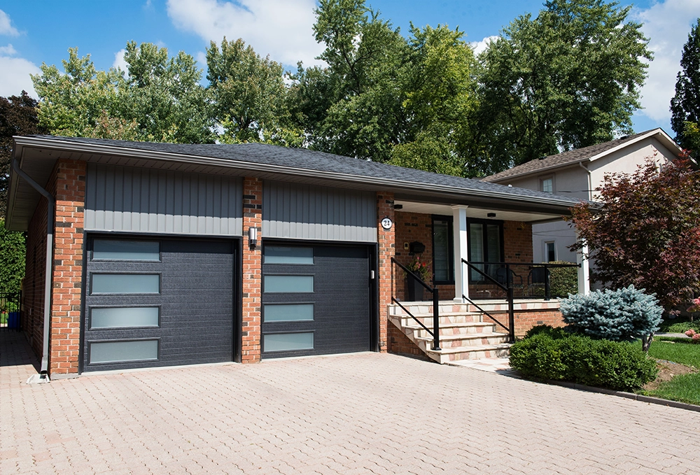
The exterior received new extruded aluminum-clad black windows and exterior doors including a garage door, creating great curb appeal. Finally, the exterior was waterproofed to protect the home and the renovations.

